With over 1.4M downloads per week at the time of writing, React Native has proven itself a smash hit when it comes to cross-platform mobile development. Writing React apps in JavaScript that render natively means performant mobile apps can be created by web developers. It’s little wonder that the teams behind the mobile apps for Shopify, Uber Eats, Pinterest, and Discord are using React Native to share code between their Android and iOS apps.
The popular Expo framework offers a lot of helpful features on top of React Native, including easy setup and testing, over-the-air updates, and seamless internationalization (i18n) and localization (l10n). The latter is exactly what we’ll tackle in this guide: Localizing a React Native app with Expo’s powerful i18n features.
Getting ready for React Native localization: Package versions
For this tutorial we will be using the following packages.
- expo (48.0.11)
- expo-localization (14.1.1)
- i18n-js (4.3.4)
- make-plural (7.3.0)
- react-native (0.71.6)
- react (18.2.0)
Getting started
For this tutorial we will internationalise and localize a weather application.

Our simple weather app consists of a greeting at the top, a weather icon, description and temperature. You can find the starting point on Github.
🗒️ Note » For brevity, our app will not fetch weather from any service. We will instead mock the weather data.
Getting user’s language and locale
First we need to be able to get a user’s system default language and locale. You can use a package called expo-localization. This package provides a simple API for detecting the user’s language and country, as well as for formatting dates and times according to the user’s locale.
To install this package, run the following command in your project directory:
npm install expo-localizationCode language: Bash (bash)In App.js file, add the following code:
// ./App.js
// ...
import React, { useState } from "react"
import { Text } from 'react-native'
import * as Localization from 'expo-localization
export default function App() {
//...
let [locale, setLocale] = useState(Localization.locale)
return (
<>
<Container>
<Text>{locale}</Text>
// ...
</Container>
</>
);
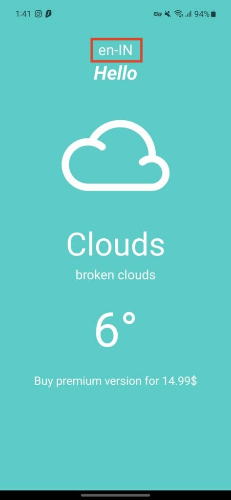
}Code language: JavaScript (javascript)On reloading the app, you can now see the user’s locale displaying as en-IN. In this case the user’s language is set to English and region is set to India.

Returning localized strings
The app currently consists of some hard-coded text. We’d like to be able to localize these. If the user changes the language of their phone in their system settings, we want UI strings like “Hello” and “Buy premium version for 14.99$” to show in the user’s system default language.
We will use the i18n-js package to localize our UI strings. To install this package, run the following command in your project directory:
npm expo install i18n-jsCode language: Bash (bash)Now create a new file localization.js in the project root directory and add the following code:
// ./localization.js
const translations = {
    en : {
        greeting: "Hello",
        subscribe : "Buy premium version for 14.99$"
    },

    de :{
        greeting: "Hallo",
        subscribe: "HoKaufen Sie die Premium-Version für 14.99$"
    }

}
export { translations };Code language: JavaScript (javascript)
The keys in the above example can either be language codes or language and region codes.
Here are some examples:
- Language codes: en (English), fr (French), zh (Chinese), ru (Russian), ar (Arabic), hi (Hindi)
- Language region codes: en-US (English – United States), en-GB (English – United Kingdom), zh-CN (Chinese – China), ru-RU (Russian – Russia), pt-BR (Portuguese – Brazil)
i18n-js follows the BCP 47 language tag format, which consists of a language code followed by an optional region code separated by a hyphen. This allows for more specific localization based on language and region combinations. Our app will support English (en) and German (de). Feel free to use any languages (and regions) you want.
Now in App.js, make the following changes:
// ./App.js

// ...
import React, { useState } from "react";
import * as Localization from 'expo-localization';
import { I18n } from 'i18n-js'
import { translations } from './localization';


export default function App() {
	const i18n = new I18n(translations)
  let [locale, setLocale] = useState(Localization.locale)
  i18n.locale = locale
  return (
    <>
      <Container>
          <Text>{locale}</Text>
          <Text>{i18n.t('greeting')}</Text>
        //...
        <Text>{i18n.t('subscribe')}</Text>
      </Container>
    </>
  );
}Code language: JavaScript (javascript)
On reloading the app, you will now see an error. This happens because the phone’s locale is set to en-IN while we only have defined languages en and de in the localization.js file.

To fix this, make the following changes to App.js
// ./App.js

//...

export default function App() {
  const i18n = new I18n(translations)
  i18n.locale = Localization.locale
  i18n.enableFallback = true
  i18n.defaultLocale = "en"

//...

}Code language: JavaScript (javascript)
By setting i18n.enableFallback = true , we make sure that if a user’s locale (en-IN) isn’t supported, i18n falls back to our English (en) translation messages. Similarly, if we had a user with the de-BE locale (German-Belgium), they would see our German (de) translations.
However this isn’t sufficient. There could be a scenario where the user’s language isn’t supported. In that case, it is a good idea to set a default locale for i18n. We’re using en as the default locale here. This ensures that if the user’s language isn’t supported by the app, the user will still see our English translations and never get the above error.
Now after reloading the app, you will notice that the app respects user’s locale.


Interpolation
Currently the string “Buy premium version for 14.99$” doesn’t use the price that is returned from the API field.
🗒️ Note » To keep this tutorial brief, we are mocking an API response instead of fetching it using network.
In App.js, we have defined a mock response:
// ./App.js

const dailyWeatherMock = {
  main: "clouds",
  description: "broken_clouds",
  icon: "04n",
  maxInCelsius: 9.2,
  maxInFahrenheit: 9.2,
  currentInCelsius: 6,
  currentInFahrenheit:6,
  price:18.99,
}Code language: JavaScript (javascript)
We need to inject the price into our translation strings instead of hard-coding it. Go to the localization.js file and make the following changes:
// ./localization.js

const translations = {
    en : {
        greeting: "Hello",
-       subscribe : "Buy premium version for 14.99$"
+       subscribe : "Buy premium version for %{price}",
    },

    de :{
        greeting: "Hallo",
-       subscribe: "HoKaufen Sie die Premium-Version für 14.99$"
+       subscribe: "HoKaufen Sie die Premium-Version für %{price}",
    }
}

export { translations };Code language: Diff (diff)
Now in the App.js file, add the price parameter where we call the i18n.t() method.
// ./App.js
// ...

export default function App() {
// ...

  return (
    <>
      <Container>
	      // ...
-       <Text>{i18n.t('subscribe')}</Text>
+       <Text>{i18n.t('subscribe', {price : daily?.price})}</Text>
      </Container>
    </>
  );
}Code language: Diff (diff)
The application now appends the price dynamically to the subscribe text defined in the localization.js file.

Localizing currency
As of now, we show that the subscription price is shown without the currency symbol. To provide the best user experience, it is imperative that we show the price in user’s country’s currency.
🗒️ Note » In a real world app, you’d use a real-time currency converter to display the value in the user’s currency. To focus on formatting, let’s assume that the value remains the same irrespective of user’s currency.
To get the user’s currency symbol, make the following changes in App.js file:
// ./App.js

// ...

export default function App() {

	// ...
  const localProperties = Localization.getLocales()[0]
  const currencyCode = localProperties.currencyCode
	const localizedPrice = new Intl.NumberFormat(locale, { style: 'currency', currency: currencyCode }).format(daily?.price)

  return (
    <>
				// ...
        <Text>{i18n.t('subscribe', { price: localizedPrice })}</Text>
    </>
  );
}Code language: JavaScript (javascript)
Localization.getLocales() returns all user-defined supported locales in the order the user defined in their device settings. The locale with 0 index is considered the one with the highest priority. The returned response will be something like this:
 [{
    "languageTag": "pl-PL",
    "languageCode": "pl",
    "textDirection": "ltr",
    "digitGroupingSeparator": " ",
    "decimalSeparator": ",",
    "measurementSystem": "metric",
    "currencyCode": "PLN",
    "currencySymbol": "zł",
    "regionCode": "PL"
  }]Code language: JavaScript (javascript)
We then extract the currencyCode and format it using the Intl.NumberFormat object.
Now on running the app with de-DE locale as default, you will see the formatted price with the Euro symbol and while running the app with en-IN locale, you will see the price with the Rupee symbol.


Number formatting
Similarly, you can also format simple numbers using Intl.NumberFormat objects**.** For example to format a number 123456.789, use the following code:
const number = 123456789;
console.log(new Intl.NumberFormat('de-DE', { maximumSignificantDigits: 3 }).format(number))
// Expected output: "123.456.789"

console.log(new Intl.NumberFormat('en-IN', { maximumSignificantDigits: 3 }).format(number))
// Expected output: "12,34,56,789"Code language: JavaScript (javascript)
Localizing dates
We will now show the user the current date in the weather app. The dates should also take the user’s locale into consideration. For example, in en-IN, May 21th, 2023 should be represented as 21/05/2023 in the locale’s default date formatting. The default formatting for de_DE is 21.05.2023.
To localize dates, make the following changes to App.js file:
// ./App.js

// ...

export default function App() {
  // ...
  const today = new Date()
  const formattedDate = new Intl.DateTimeFormat(locale).format(today)

  return (
    <>
      <Container>
		      // ...
          <Text>{formattedDate}</Text>
        // ...
      </Container>
    </>
  );
}Code language: JavaScript (javascript)
If today is May 21, 2023, we see it localized as follows when we run our app.


🗒️ Note » You can also change the date format by passing dateStyle parameter to Intl.DateTimeFormat.
// Specify date and time format using "style" options (i.e. full, long, medium, short)
console.log(new Intl.DateTimeFormat('en-GB', { dateStyle: 'full').format(date))
// Expected output: "Sunday, 21 May, 2023 at 6:16:52 am GMT+10"Code language: TypeScript (typescript)
Plurals
Handling plurals is an important aspect of internationalization. Different languages have different rules for plural forms, and it’s crucial to handle them correctly in your app.
Now, let us add another text component under current temperature, representing maximum temperature to demonstrate this example.
In the localization.js file, add the new key temperature and with their values in plural and singular firms.
// ./localization.js

const translations = {
  en: {
    // ...
    temperature: {
      one: "%{count} degree",
      other: "%{count} degrees",
    },
  },

  de: {
    // ...
    temperature: {
      one: "%{count} grad",
      other: "%{count} grade",
    },
  },
}Code language: JavaScript (javascript)
In the App.js file, make the following changes:
// ./App.js
// ...

const dailyWeatherMock = {
  // ...
  maxInCelsius: 9.2,
  // ...
}

export default function App() {
  const daily = dailyWeatherMock;
  const i18n = new I18n(translations)
  // ...

  return (
    <>
      <Container>
					// ...
          <Text>{i18n.t("temperature", {count: daily.maxInCelsius})}</Text>
	        // ...
      </Container>
    </>
  );
}Code language: JavaScript (javascript)
Upon running the app, you will notice that plurals are now being considered while localizing Strings. When the value is 1, the max temperature is rendered as “1 degree”.

For a zero value, we get “0 degrees”. Similarly, for a value of 15, we get “15 degrees.”

Complex plurals
Languages can have many forms of plurals. In English, we have a simple distinction between the singular form “book” and the plural form “books.” The plural form is used for any count other than 1.
| English | Russian |
| 0 books | 0 книг (knig) |
| 1 book | 1 книга (knigi) |
| 2 books | 2 книги (knigi) |
| 3 books | 3 книги (knigi) |
| 4 books | 4 книги (knigi) |
| 5 books | 5 книг (knig) |
In Russian, the plural forms are more complex. The word for “book” in the singular form is “книга” (kniga). However, the plural form has different variations depending on the count. For counts ending in 2, 3, or 4 (except those ending in 12, 13, or 14), the word “книги” (knigi) is used. For any other count, including 0, 1, and numbers ending in 0 or those ending in 5-9, the word “книг” (knig) is used.
🗒️ Note » The default keywords for pluralisation offered by i18n-js library are zero, one, and other which isn’t sufficient to include all types of plurals. Here’s an example that uses complex plurals for Russian.
npm install make-pluralCode language: plaintext (plaintext)You can now specify additional categories for plurals now.

Resource: You can find plural rules for various languages here.
Now in the localization.js file, you can define the translations for all plural categories.
const translations = {
  en: {
    steps: {
      one: "%{count} book",
      other: "%{count} books",
    },
  },
  ru: {
    steps: {
      one: "%{count} книга",
      few: "%{count} книги",
      many: "%{count} книг",
      other: "%{count} книг",
    },
  }
}Code language: JavaScript (javascript)
Now in the App.js file
import { I18n } from 'i18n-js'
import { translations } from './localization'
import 'intl-pluralrules'
import { useMakePlural } from "i18n-js"
import * as Localization from 'expo-localization'
import { ru } from "make-plural"

export default function App() {

  const i18n = new I18n(translations)
  i18n.locale = "ru"
  i18n.enableFallback = true
  i18n.defaultLocale = "en"

	i18n.pluralization.register("ru", useMakePlural({ pluralizer: ru }))

  console.log(i18n.t('steps', { count: 0 })) //0 книг
  console.log(i18n.t('steps', { count: 1 })) //1 книга
  console.log(i18n.t('steps', { count: 2 })) //2 книги
  console.log(i18n.t('steps', { count: 3 })) //3 книги
  console.log(i18n.t('steps', { count: 4 })) //4 книги
  console.log(i18n.t('steps', { count: 5 })) //5 книг
  console.log(i18n.t('steps', { count: 6 })) //6 книг
  console.log(i18n.t('steps', { count: 7 })) //7 книг

}Code language: JavaScript (javascript)
Localizing measurement
Currently the app doesn’t respect user’s preferred measurement system (metric or imperial), which is based on the device’s locale. We will now display the current temperature in user’s preferred measurement system.
Make the following changes in localization.js file:
// ./localization.js

const translations = {
    en: {
	      // ...
				// we will use Celsius for metric system
        current_temp_in_celsius: "%{degree}°C",
				// we will use Fahrenheit for imperial system
        current_temp_in_fahrenheit: "%{degree}°F",
    },
		ar: {
				// ..
		    current_temp_in_celsius: "درجة مئوية %{degree}",
		    current_temp_in_fahrenheit: "درجة فهرنهايت %{degree}",
  },
	// ...Code language: JavaScript (javascript)
🗒️ Note » We do not add translations for any other languages because in most languages the temperature Units are represented in °C or °F which we defines for en language (which is our fallback language).
In the App.js file, make the following changes:
// ./App.js

//...

export default function App() {

  let [locale, setLocale] = useState(Localization.locale);

  // ...
  let { measurementSystem } = Localization.getLocales()[0]

  let currentTemperature =
    measurementSystem === "metric"
    ? i18n.t("current_temp_in_celsius", { degree: daily.currentInCelsius })
    : i18n.t("current_temp_in_fahrenheit", { degree: daily.currentInFahrenheit })

  return (
    <>
      <Container>
					// ...
          <Text>{currentTemperature}</Text>
					// ...
      </Container>
    </>
  );
}Code language: JavaScript (javascript)
Upon running the app with the device locale set to en-US, the current temperature will be shown in degrees Fahrenheit (F):

While running the app with en-IN or de-DE as default locale, the current temperature will be shown in degree Celsius (C).

Change Language from within the Application
As of now, the only way for a user to change the language of the app is by using their system settings. We will now add a feature to toggle supported languages from within the app.
In the App.js file, make the following settings
// ./App.js

import React, { useState } from "react";
import { Text, Button } from 'react-native';
import * as Localization from 'expo-localization';
import { I18n } from 'i18n-js'
import { translations } from './localization';

export default function App() {
	// By default pick the locale from System settings
  let [locale, setLocale] = useState(Localization.locale);
  const daily = dailyWeatherMock;
  const i18n = new I18n(translations)
  i18n.locale = locale
  i18n.enableFallback = true
  i18n.defaultLocale = "en";

  return (
    <>
		    // ...
           <Button onPress={() => setLocale("en")} title="English" color="#841584" />
           <Button onPress={() => setLocale("de")} title="German" color="#841584" />
    </>
  );
}Code language: JavaScript (javascript)
When the button is pressed, we change the locale using the setLocale() method passing in the Locale param.

Adding right-to-left support
Languages that use scripts like Arabic, Hebrew, Farsi, and Urdu are written from right to left (RTL), while languages like English, French, and Spanish are written from left to right (LTR). Let’s accommodate RTL languages in our app.
To demonstrate the change in layout direction, we will add a title “The Weather App” on the top left of the app for LTR languages and on top right for RTL languages.
Make the following changes to App.js file:
Go to app.json file and make the following changes:
// app.json

{
  "expo": {
    "extra": {
      "supportsRTL": true
    },
    "plugins": ["expo-localization"],
		// ...
  }
}Code language: JSON / JSON with Comments (json)
In the localization.js file, add a new language locale ur(Urdu) and make the following changes:
// /localization.js

const translations = {
  en: {
    greeting: "Hello",
    app_title: "The Weather App",
		// ...
  },
  ur: {
    greeting: "ہیلو",
    app_title: "موسم کی ایپ",
		// ...
  },Code language: JavaScript (javascript)
Now in the App.js file, make the following changes:
// ./App.js

import React, { useEffect, useState } from "react"
import { Text, View, Button, I18nManager } from 'react-native'
import * as Localization from 'expo-localization'
import { I18n } from 'i18n-js'
import { translations } from './localization'

export default function App() {
	//...

  return (
    <>
      <View style={styles.container}>
        <View style={styles.title}>
          <Text>{i18n.t('app_title')}</Text>
        </View>
      </View>
			// ...
    </>
  )
}

const styles = StyleSheet.create({
  container: {
    paddingTop: 30,
    padding: 0,
    backgroundColor: 'pink',
  },
  title: {
    fontSize: 35,
    paddingVertical: 5,
    height: 40,
    width: '100%',

    // 👇 Using "start" rules instead of "left" and
    //    and "right" makes the layout adapt to RTL
    marginStart: 20,
    alignItems: 'flex-start'
  },
})Code language: JavaScript (javascript)
On running the app with locale en-IN, you will see the following screen. The title “The Weather App” is displayed on the top left.

On running the app with locale ur-IN, you see the following screen. The title “The Weather App” is displayed on the top right since Urdu is RTL language so the screen layout is mirrored.

🗒️ Note » To style the View we used maginStart and flex-start styling which respects the current layout direction i.e when the language is LTR, the margin is from the left end and the title is aligned towards the left end too. But when the language is RTL, everything is aligned from the right end. UsingmarginLeft and marginRightinstead will not respect the layout direction.
Wrapping up our React Native localization guide
In this article, we discussed the importance of internationalisation and localization in a React Native weather app. We used the i18n-js and Expo Localization libraries to localize the app’s text content, date format, and temperature units. Overall, internationalising and localizing a React Native app can be challenging, but the i18n-js and Expo Localization libraries provide useful tools to make the process easier. By following the steps outlined in this article, you can create a more inclusive and user-friendly app that can appeal to a wider audience.
You can find the final project on GitHub.