In the ever-evolving landscape of web development, CSS has grown by leaps and bounds, transforming the way we design, build, and interact with web content. Yet one of its most powerful capabilities remains largely underutilized: CSS localization.
This guide aims to remedy this, covering the ins and outs of CSS localization. We start with essential HTML attributes for language-specific styling and directional text — including right-to-left layouts, and vertical text presentations for East Asian scripts. Logical properties are the perfect complement for these vertical and right-to-left layouts, and we cover those too.
We hope to offer designers and developers some hidden gems of CSS that can make your pages more inclusive, and available to a global audience without too much effort.
💡 Internationalization (i18n) and localization (l10n) allow us to make our apps available in different languages and to different regions, often for more profit. If you’re new to i18n and l10n, check out our guide to internationalization.
🔗 You can interact and play with many of the concepts we cover here via our live demo on StackBlitz. You can also get all the demo code from GitHub.
The lang attribute
Setting the lang attribute is the most essential thing we can do when localizing our web pages. lang is a global attribute, meaning that it’s available on all HTML tags. Since we normally use a single language on a given page, the most common use of lang is setting it on the <html> document element.
<!DOCTYPE html>
<!-- 👇 Set the language of the
        document to English. -->
<html lang="en">
<head>
  <meta charset="UTF-8">
  <meta name="viewport" content="width=device-width, initial-scale=1.0">
  <title>An English Page</title>
</head>
<body>
  <h1>A English Page</h1>
  <!-- ... -->
</body>
</html>Code language: HTML, XML (xml)
🗒️ When setting the lang attribute on HTML elements, we typically use an IETF BCP 47 language tag. BCP 47 tags begin with a language code — en for English, fr for French, es for Spanish — and have optional region specifiers (more on regions a bit later).
🔗 Check out the list of language tags on Wikipedia.
In the above example, we set the entire document to English by using the language tag, en.
<html lang="en">Code language: HTML, XML (xml)Setting the lang attribute makes using proper pronunciation easier for screen readers and other assistive technologies. It also lets search engines know which language our page is in, which helps with SEO (Search Engine Optimization).
🔗 Read more about the lang attribute on MDN.
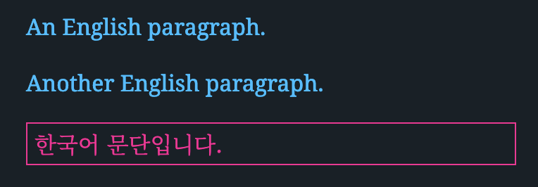
We can set lang on almost any HTML element. For example, we might have a Korean paragraph in the middle of our otherwise English page.
<html lang="en">
  <!-- ... -->
  <body>
    <p>An English paragraph.</p>
    <p>Another English paragraph.</p>
    <p lang="ko">한국어 문단입니다.</p>
  </body>
</html>Code language: HTML, XML (xml)
We can target these elements using the CSS :lang() pseudo-class. :lang(en), for example, will target any element that has lang=”en”.
/*
 * Global selector — selects any element
 * with lang="en"
 */
:lang(en) {
  color: deepskyblue;
}

/*
 * Element selector — selects all paragraphs
 * with lang="ko"
 */
p:lang(ko) {
  color: deeppink;
  border: 1px solid deeppink;
}Code language: CSS (css)
🗒️ The lang attribute doesn’t need to be set directly on the element. If the element inherits lang="en" from an ancestor in the DOM, :lang(en) will target it.
Locale specificity
We mentioned earlier that lang values are typically BCP 47 tags, which can be a language tag like en or ko. BCP 47 tags can be further specified by adding a region code according to the ISO Alpha-2 standard (like BH for Bahrain, CN for China, US for the United States). So a qualified locale identifier might appear as en-US for American English or zh-CN for Chinese as used in China.
🔗 For country codes, the ISO’s search tool is a good resource.
When targeting elements with :lang(), general locales will match more specific locales. For example, :lang(en) will match elements with lang="en" and elements with lang="en-US".
<p lang="en">Some English text.</p>
<p lang="en-US">Some American English text.</p>
<p lang="en-GB">Some British English text.</p>
<p lang="en-CA">Some Canadian English text.</p>Code language: HTML, XML (xml)p:lang(en) {
color: darkslategray;
border-bottom: 1px solid #ccc;
}
p:lang(en-CA) {
/* Canadian flag red */
color: #d80621;
}Code language: CSS (css)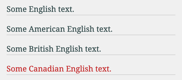
Direction (right-to-left layouts)
Languages like Arabic, Hebrew, and Urdu are read right-to-left (rtl). The dir HTML attribute handles these languages wonderfully. dir can have a value of ltr (left-to-right), rtl (right-to-left), or auto (based on content).
Again, since a web page is often in one language, and hence one direction, the most common use case for dir is setting on the html document element.
<html lang="ar" dir="rtl">
<!-- ... --> Code language: HTML, XML (xml)
All modern browsers will flow the page in the direction specified by dir.
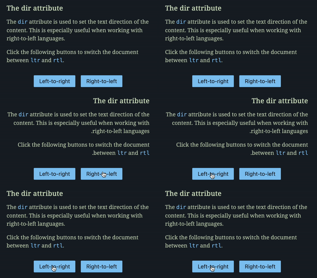
🔗 Try the above demo yourself on StackBlitz. You can also get all demo code from GitHub.
Just like lang, dir is a global attribute and can be applied to any HTML element, not just the document root.
<p dir="ltr">
  But I must explain to you how all this mistaken idea of
  denouncing pleasure and praising pain was born.
</p>

/* Should be equivalent to dir="ltr" */
<p dir="auto">
  But I must explain to you how all this mistaken idea of
  denouncing pleasure and praising pain was born.
</p>

<p dir="rtl">
  لكن لا بد أن أوضح لك أن كل هذه الأفكار المغلوطة حول
  استنكار النشوة وتمجيد الألم نشأت بالفعل
</p>

/* Should be equivalent to dir="rtl" */
<p dir="auto">
  لكن لا بد أن أوضح لك أن كل هذه الأفكار المغلوطة حول
  استنكار النشوة وتمجيد الألم نشأت بالفعل
</p>Code language: HTML, XML (xml)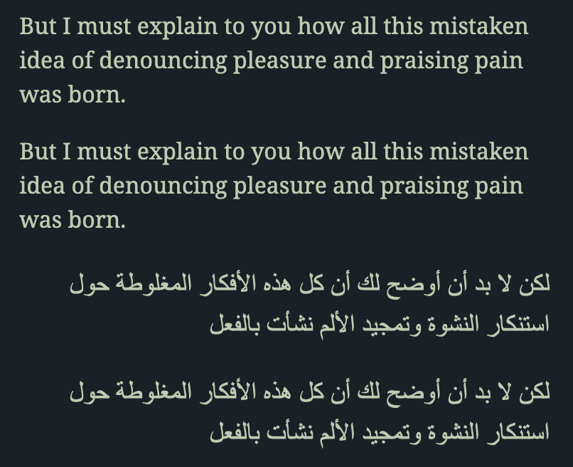
In CSS, we can target rtl and ltr elements with normal attribute selectors.
[dir="ltr"] {
  padding-left: 1rem;
  border-left: 2px solid deepskyblue;
}

[dir="rtl"] {
  padding-right: 1rem;
  border-right: 2px solid deepskyblue;
}Code language: CSS (css)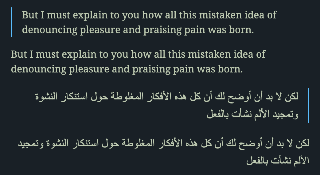
The dir="auto" case is interesting: The browser will look at the first character with strong directionality in the element and use that to set the element’s direction. It’s best to be explicit and use ltr | rtl. However, dir="auto" can be helpful when presenting content we don’t control, like user-generated text.
Notice that the CSS attribute selectors, [dir="ltr"] and [dir="rtl"], don’t target dir="auto". We can use the :dir() pseudo-class for this.
:dir(ltr) {
  padding-left: 1rem;
  border-left: 2px solid deepskyblue;
}

:dir(rtl) {
  padding-right: 1rem;
  border-right: 2px solid deepskyblue;
}Code language: CSS (css)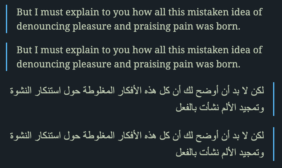
🗒️ At the time of writing the :dir() pseudo-class selector was supported by approximately 80% of globally used browsers. In contrast, attribute selectors like [dir="ltr"] enjoy nearly 100% coverage.
✋ In addition to the HTML dir attribute, a CSS direction property also exists. However, it’s best practice to prefer the HTML dir attribute where possible.
🤿 If you’re looking to override text direction inside runs of text, check out the <bdo> HTML element. For isolating elements inside text runs, look at the <bdi> element.
🔗 Check out the MDN docs for the dir attribute for further reading.
Writing mode (vertical layouts)
A lot of East Asian writing — Chinese, Japanese, Korean, Vietnamese — can be written horizontally or vertically. The traditional orientation for these East Asian scripts was top-to-bottom, then right-to-left.
🤿 The Wikipedia entry, Horizontal and vertical writing in East Asian scripts, is an interesting read here.
Today, horizontal, left-to-right orientation for East Asian languages is more common, especially in print and digital. However, modern browsers do support vertical layouts via the writing-mode CSS property.
writing-mode can take one of three values:
.wm-htb {
  /* Horizontal, then top-to-bottom (default). */
  writing-mode: horizontal-tb;
}

.wm-vrl {
  /* Vertical, then right-to-left. */
  writing-mode: vertical-rl;
}

.wm-vlr {
  /* Vertical, then left-to-right. */
  writing-mode: vertical-lr;
}Code language: CSS (css)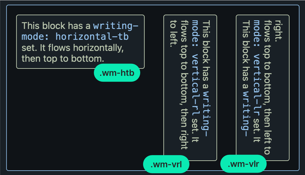
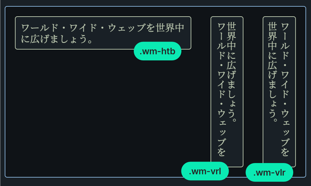
Of course, vertical modes are meant for East Asian scripts. The following is an example in Japanese. Note that, unlike English, Japanese characters keep a fixed rotation whether they’re displayed horizontally or vertically.
🗒️ With nearly 100% global browser support you can freely use the writing-mode property.
🔗 Check out the MDN writing-mode entry for more info.
🔗 Styling vertical Chinese, Japanese, Korean and Mongolian text from the W3C is a good concise guide.
🔗 Play with different writing modes live on the Layout page of our StackBlitz demo. If you want to run the code on your machine, clone or download our GitHub repo.
Logical properties
CSS layout properties that control element size, position, and spacing have traditionally been physical, like top or padding-right. The direction of physical properties is effectively based on the screen coordinate system.
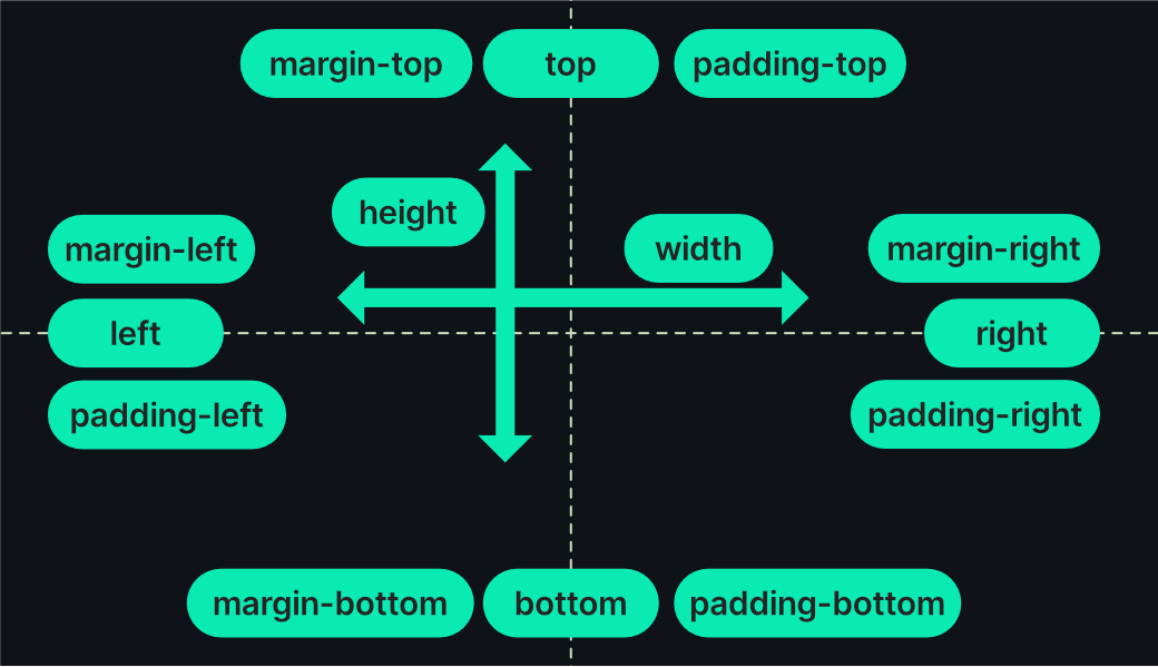
Physical properties don’t respect dir and writing-mode: right is always the physical right side of an element. To accommodate ltr and rtl layouts, we would have to target these directions and write separate rules for each:
[dir="ltr"] .element {
  margin-left: 50px;
}

[dir="rtl"] .element {
  margin-right: 50px;
}Code language: CSS (css)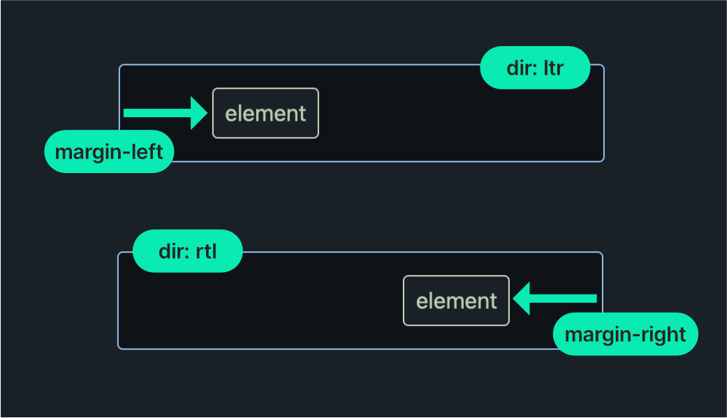
More recently, however, the CSS standard has adopted logical properties. Logical properties adapt to both the dir and writing-mode of an element. Here’s the same example with a logical margin:
.element {
  margin-inline-start: 50px;
}Code language: CSS (css)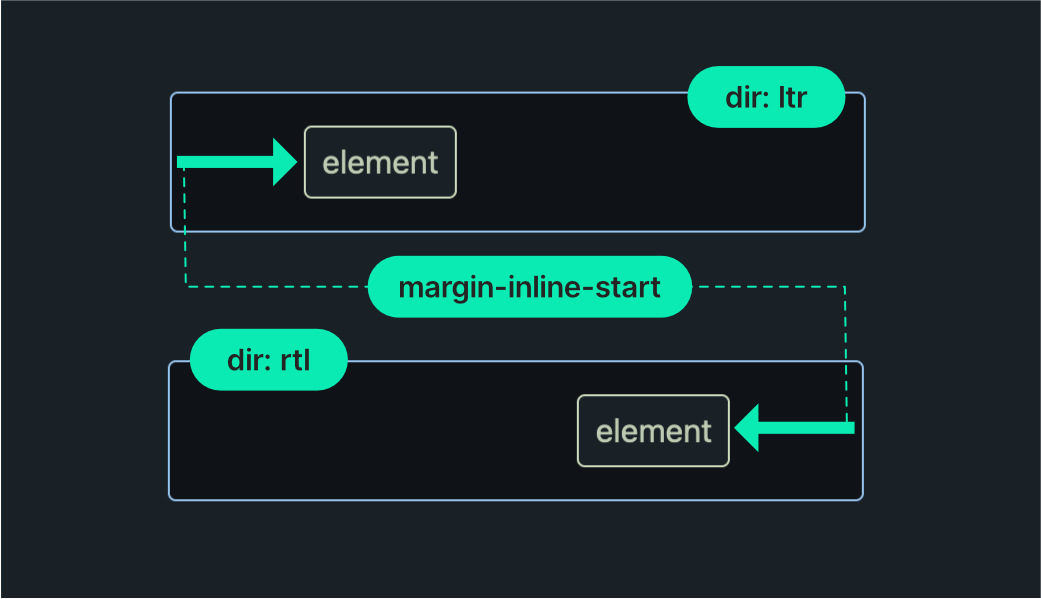
Notice how we only needed to set the margin-inline-start property once: The browser responds to the container’s direction, interpreting inline-start as left when dir="ltr" and right when dir="rtl".
🗒️ At the time of writing, logical properties enjoy 95% global browser support, so there’s little reason not to prefer them over their physical counterparts.
Logical properties automatically adapt to dir and writing-mode, and we’ll see this in action as we explore the most important logical properties in the following sections.
🔗 CSS logical properties and values on MDN is an excellent resource.
A note on inline and block
When working with logical properties, we’ll be using inline and block instead of top, down, left, and right.
- Block dimension is the direction that text stacks, like lines in a paragraph. It’s up and down (vertical) when you’re reading text written from left to right, like in English. But if you’re reading text that goes from top to bottom, like in traditional Japanese, the block dimension switches to side-to-side (horizontal).
- Inline dimension is the direction text flows within a line, side-to-side (horizontal) in languages like English, but up and down (vertical) in vertically written text, such as traditional Chinese or Japanese.
It’s much easier to understand this with examples, so let’s dive into the properties themselves.
Sizing
Physical CSS sizing is controlled with width, height, and their min- and max- equivalents. The logical size counterparts are inline-size, block-size, with their min- and max- versions.
.physical-sizing {
  width: 210px;
  height: 80px;
}

.logical-sizing {
  inline-size: 210px;
  block-size: 80px;
}Code language: CSS (css)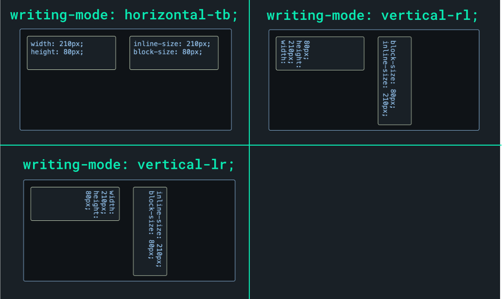
Sizing isn’t affected by dir, of course. It is affected by writing-mode, as seen in the above diagram. Note how the box set with physical width and height keeps its dimensions regardless of the writing-mode. In contrast, inline-size and box-size cause the box dimensions to adapt to vertical orientations.
It can be helpful to have a mapping between physical properties and their logical equivalents, so here is the simple mapping for sizing properties:
| Physical property | Logical property (writing-mode: horizontal-tb) |
| width | inline-size |
| height | block-size |
🗒️ We omit min- and max- property variants for brevity, but you get the idea.
🔗 Read more in the Properties for sizing section of the logical properties MDN page.
Positioning
Physical positioning is achieved with inset, top, right, bottom, and left. For logical positioning, we have inset-block, inset-inline, with -start and -end variants.
.physical-positioning {
  position: absolute;
  top: 20px;
  right: 20px;
}

.logical-positioning {
  position: absolute;
  inset-block-start: 20px;
  inset-inline-end: 20px;
}Code language: CSS (css)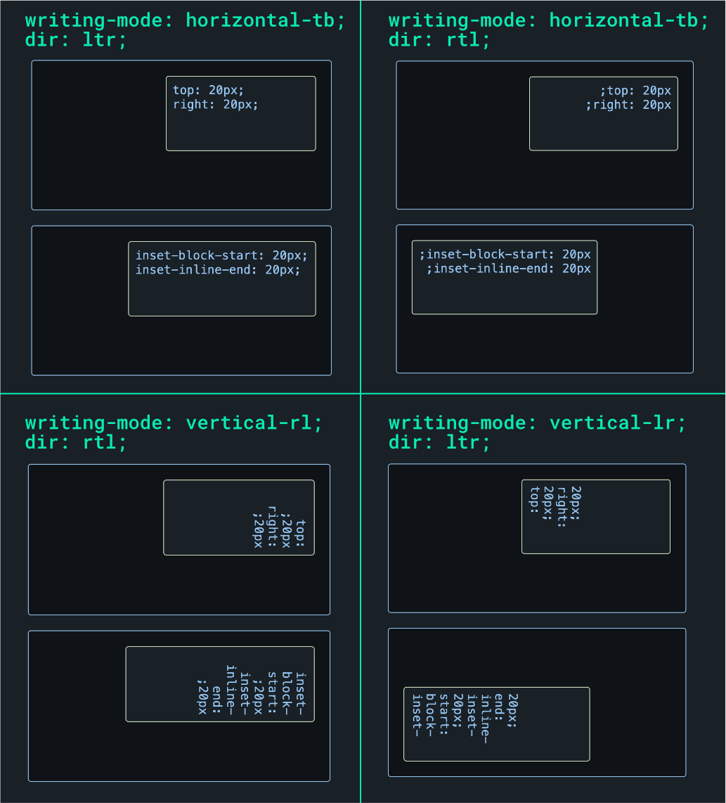
Logical positioning adapts to both dir and writing-mode. Here are the physical-to-logical positioning mappings:
| Physical property | Logical property (writing-mode: horizontal-tb; dir: ltr) |
| top | inset-block-start |
| bottom | inset-block-end |
| left | inset-inline-start |
| right | inset-inline-end |
🔗 Read more in the Properties for positioning section of the logical properties MDN page.
Spacing
Our trusty margin and padding values are how we space elements physically. Their logical equivalents are margin-block and margin-inline.
.physical-spacing {
  margin-top: 40px;
  padding-right: 60px;
}

.logical-spacing {
  margin-block-start: 40px;
  padding-inline-end: 60px;
}Code language: CSS (css)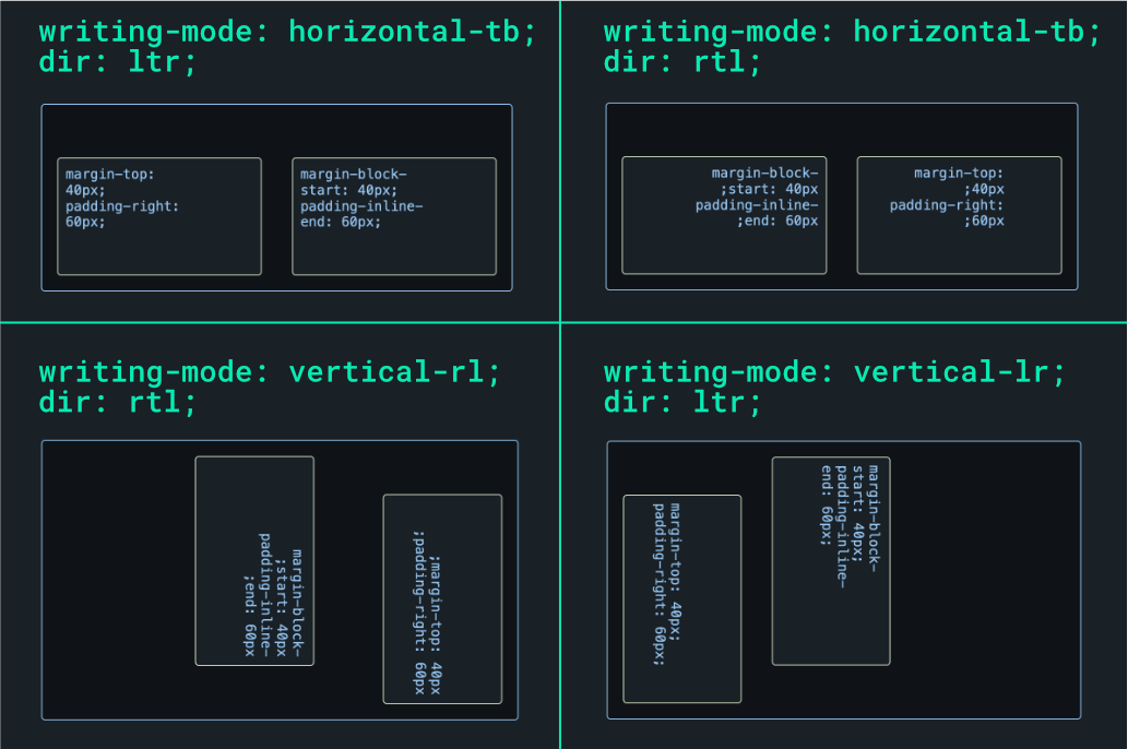
As you might have guessed, logical margins and paddings adapt to both dir and writing-mode. Here are the physical-to-logical spacing mappings:
| Physical property | Logical property (writing-mode: horizontal-tb; dir: ltr) |
| margin-top | margin-block-start |
| margin-bottom | margin-block-end |
| margin-left | margin-inline-start |
| margin-right | margin-inline-end |
| padding-top | padding-block-start |
| padding-bottom | padding-block-end |
| padding-left | padding-inline-start |
| padding-right | padding-inline-end |
🔗 Read more in the Properties for margins and Properties for paddings section of the logical properties MDN page.
Other logical properties
There are logical properties for borders, border radius, and more. To keep things brief, we’ll refer you to the full list on MDN.
✋ The logical properties we covered above, along with those for border and border-radius, have excellent modern browser support. For others, always check browser compatibility before using them in production.
🔗 We cover logical border properties and more in our companion demo. Play with it live on StackBlitz or get the code from GitHub.
Fonts
Let’s switch gears and look at localization and typography. When it comes to typefaces, want to choose fonts that support all the characters in our language’s scripts e.g. Latin, Arabic, Korean, etc. Some common options are system fonts, multilingual fonts, and Google Noto.
System fonts
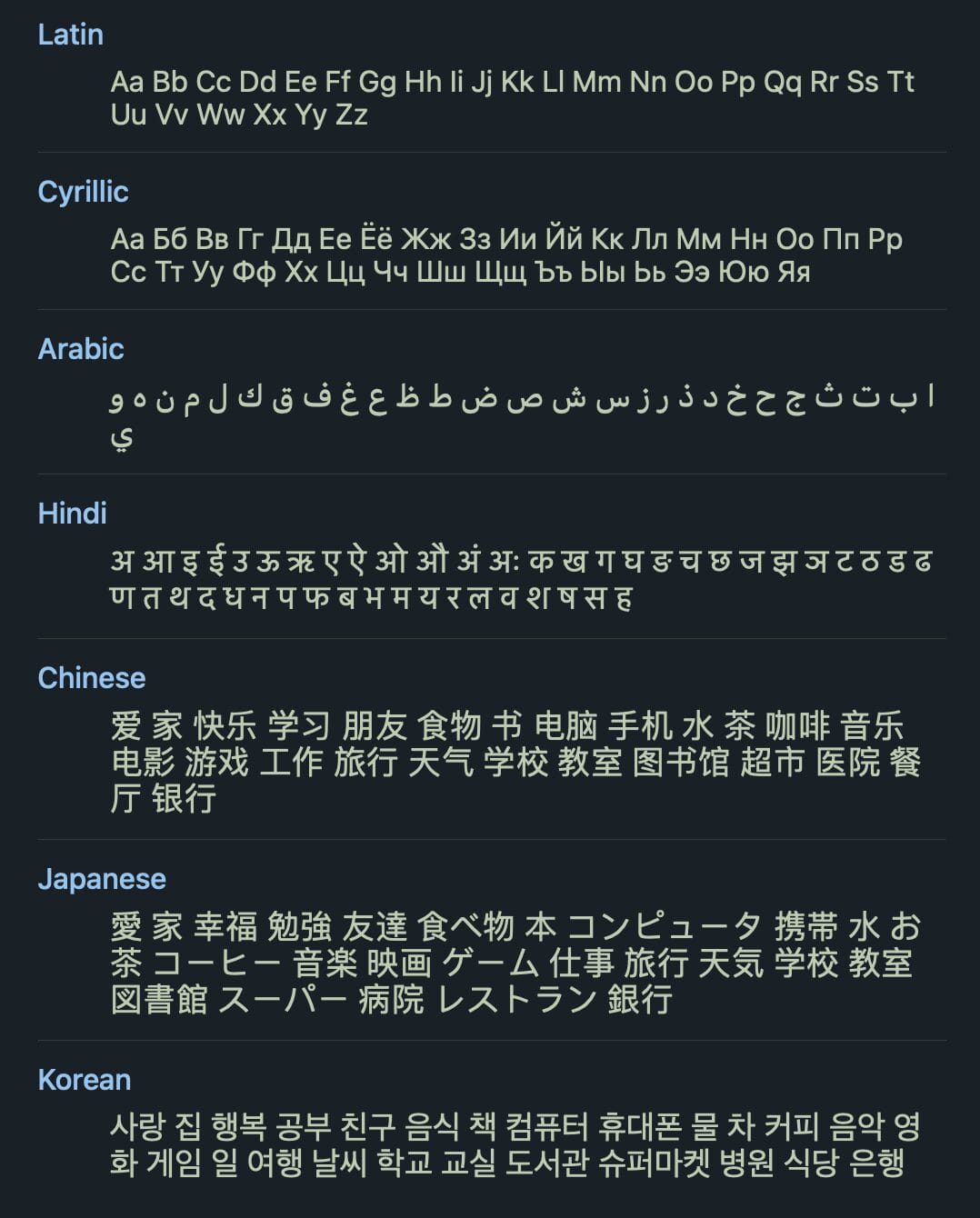
A font will often cover a few languages but leave out many. System fonts, however, tend to have wide language coverage and are pre-installed on operating systems. So they’re generally safe to use for multilingual sites. The Windows default system font is Segoe UI, macOS and iOS use San Francisco, and Android uses Roboto.
Here’s a common system font stack:
html {
  font-family: system-ui, "Segoe UI", Roboto, Helvetica,
    Arial, sans-serif, "Apple Color Emoji", "Segoe UI Emoji";
}Code language: CSS (css)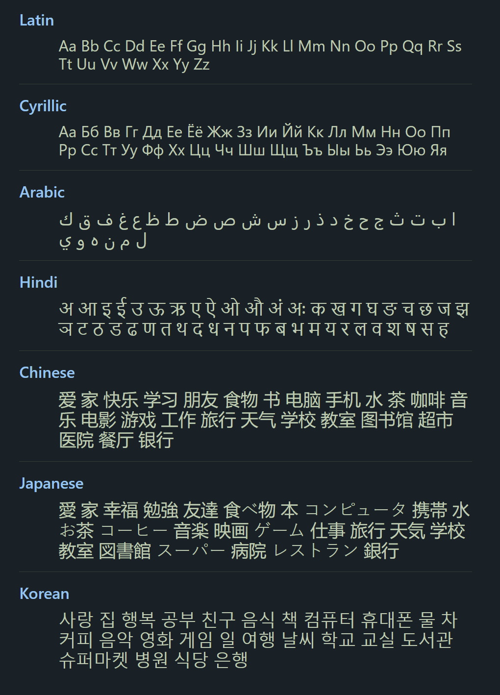
Multilingual fonts
While safe, system fonts don’t always represent our brand. We might want to control the fonts on our websites to ensure a consistent experience for our visitors no matter their operating system. Multilingual fonts can fit the bill here, depending on the languages you need covering. Here are some multilingual fonts (keep in mind these are all paid):
Helvetica World
Languages covered: Arabic, Bulgarian, Bosnian, Catalan, Czech, Danish, German, Greek, English, Spanish, Estonian, Finnish, French, Irish, Hebrew, Croatian, Hungarian, Icelandic, Italian, Lithuanian, Latvian, Maltese, Dutch, Norwegian, Polish, Portuguese, Romanian, Russian, Slovak, Slovenian, Albanian, Serbian, Swedish, Turkish.
🔗 Get Helvetica World from MyFonts.
Neue Helvetica World
Languages covered: Arabic, Bulgarian, Bosnian, Catalan, Czech, Danish, German, Greek, English, Spanish, Estonian, Finnish, French, Irish, Hebrew, Croatian, Hungarian, Icelandic, Italian, Lithuanian, Latvian, Maltese, Dutch, Norwegian, Polish, Portuguese, Romanian, Russian, Slovak, Slovenian, Albanian, Serbian, Swedish, Turkish.
🔗 Get Neue Helvetica World from MyFonts.
Greta Sans
Languages covered: Arabic, Armenian, Cyrillic, Devanagari, Georgian, Greek, Hebrew, Korean, Latin.
🔗 Get Greta Sans from Typothque.
Google Noto
If a multilingual font meets your needs it could be a good fit for your brand. If, however, you want near-universal language coverage, check out Google Noto. Not only is the Noto font collection free, but it also has outstanding language coverage. Noto isn’t just one font: It’s a system of fonts that were designed to look good and work well together while covering over 1,000 languages!
After assembling our desired Noto collection from Google Fonts, we can target languages with the CSS :lang() pseudo-class to set them.
:lang(en) {
  font-family: "Noto Serif", serif;
}

:lang(ar) {
  font-family: "Noto Naskh Arabic", "Noto Serif", serif;
}

:lang(jp) {
  font-family: "Noto Serif JP", sans-serif;
}Code language: CSS (css)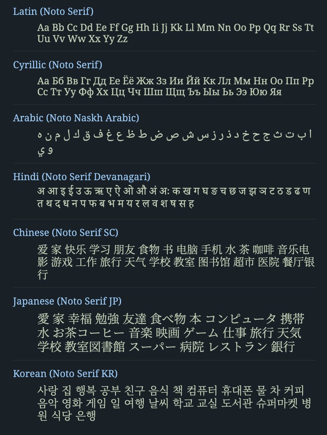
Font fallback
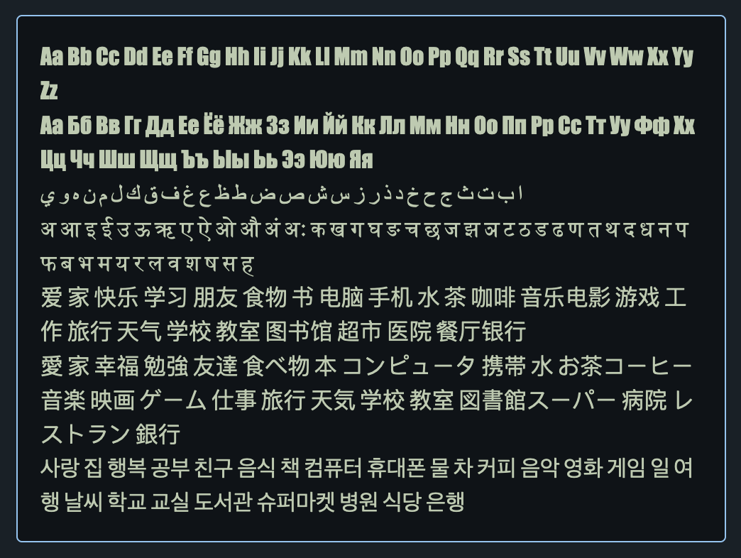
If a font doesn’t support a particular script, the browser will fall back to a font that does. We can get ahead of this by specifying a fallback font in our CSS. The following uses the Impact font without fallback.
.font-no-fallback {
  font-family: Impact;
}Code language: CSS (css)
Note how non-Latin glyphs fall back to the system font.
Here’s a Noto stack with fallback:
.font-fallback {
  font-family: "Noto Naskh Arabic", "Noto Serif Devanagari",
    "Noto Serif SC", "Noto Serif KR", "Noto Serif JP",
    "Noto Serif", serif;
}Code language: CSS (css)
Since we’ve controlled the fallback, we can be confident that our supported language glyphs will be covered.
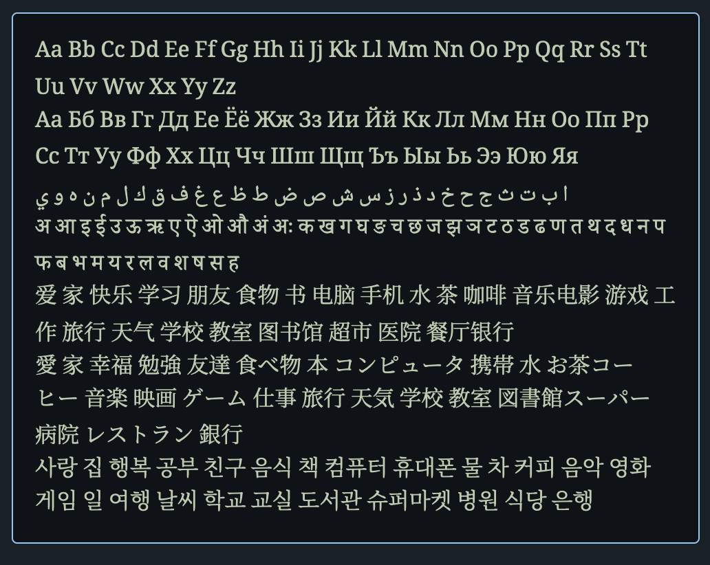
Of course, this solution means that we need to load all of our fonts on the page, which can be a performance issue. It’s probably wiser to load only the fonts our main page language uses, and use system font fallback for secondary languages.
🗒️ An alternative is to mix and match, creating our own collection, where different fonts cover different supported subsets of our languages. We cover this briefly in our demo app — play with the demo on StackBlitz or download the code from GitHub and run it on our machine.
Pronunciation marks
Some languages add pronunciation text or marks to their scripts, like Ruby or diacritics. Modern CSS allows us to target some of these marks and control their appearance.
Ruby
Ruby annotations are small texts placed above or to the right of the base text to give pronunciation guides, and explanations, or to show the use of characters in East Asian languages.
Ruby has special HTML tags:
<p lang="jp">
  <ruby>
    東京 <rp>(</rp> <rt>とうきょう</rt><rp>)</rp>
  </ruby>
</p>Code language: HTML, XML (xml)
<ruby> contains text that has ruby annotations. The annotations themselves go inside <rt> tags. <rp> tags are used for ruby parentheses shown to browsers that don’t support Ruby.
🔗 Read about the <ruby>, <rt>, and <rp> tags on MDN.
✋ While over 98% of globally used browsers support basic ruby, complex ruby and writing-mode with ruby are only partially supported by modern browsers. Check out Can I use for the latest info on ruby support.
We can control ruby using the ruby-position CSS property.
.ruby-over {
  ruby-position: over;
}

.ruby-under {
  ruby-position: under;
}Code language: CSS (css)
🔗 More info about the ruby-position property can be found on MDN.
Text emphasis
East Asian languages often use text emphasis marks to highlight text instead of bold or italics. We can control text emphasis style, color, and position with CSS.
<p lang="jp">
  明日は<em class="text-emphasis-dot">晴れ</em>です。
</p>

<p lang="jp">
  明日は<em
    class="text-emphasis-sesame text-emphasis-under-left"
  >晴れ</em
  >です。
</p>Code language: HTML, XML (xml)em:lang(jp) {
font-style: normal;
text-emphasis-color: deepskyblue;
text-emphasis-position: over right;
}
.text-emphasis-dot:lang(jp) {
text-emphasis-style: dot;
}
.text-emphasis-sesame:lang(jp) {
text-emphasis-style: sesame;
}
.text-emphasis-under-left:lang(jp) {
text-emphasis-position: under left;
}Code language: CSS (css)
🗒️ Japanese, Korean, Mongolian, and Chinese each have a preferred position for text emphasis and ruby, depending on whether they’re horizontal or vertical. MDN has a handy table that shows these preferences.
🔗 Play with live demo app on StackBlitz; get all the demo app code from GitHub. We cover setting quotes per language in the demo among other things.
The joy of CSS
That about does it for this guide. We hope our exploration into CSS localization has been as enlightening and enjoyable, and that it showed you a few things about the untapped potential of CSS localization. Here’s to creating vibrant, global web experiences with the ever-growing awesomeness of CSS. Happy coding!

