Localization strategy
Best Practices for Text Components in Mobile Design
As platform specialists at Evenly, we help concept, design, and develop native digital products, as well as consult on UI/UX, technical feasibility, and best practices. Mobile design for international audiences has its own UX pitfalls and requirements. In this guide, we'll address some of the key questions on text components in multilingual mobile design.
Mobile devices come in very different sizes. How can I make sure that the UI and UX will adapt well to every size?
Mobile devices come in very different sizes and orientations – just think about the difference between the screens of an iPhone SE and an iPad Pro. When designing for such a big range of screen sizes, it’s crucial to have a clear strategy on how to use space. This is important for all UI elements, but especially for text and text input fields, because those usually make up the part of the app that guides users through the product and makes the service usable in the first place.
A sensible approach is to always start with the smallest screen on which the app will be available and work your way up to the biggest screen. This way, you can make sure the important UI elements are all there and clearly visible. Scaling up is always easier than scaling down.
The good news is that you don’t have to make the same design work for all sizes – you can also create UI layouts that adapt to the screen configuration. On iOS, you can differentiate between compact (phones) and regular (tablets) size classes, with the addition that iPads can also move into compact mode when entering split view for example.
On Android, you are even more flexible (while also having more variations regarding devices) and can use view dimensions that allow the layout to resize according to the limits you defined for screen sizes. In any case, don’t only focus on how the design looks on a device in portrait mode, also check landscape, split view on tablets etc.
If there is no way to fit all texts in completely on all devices, use truncation and cut off parts of texts in specific views. Make sure there is a way for users to read the text completely (for example, by switching into landscape mode or opening another view) and that the truncated text still provides some information.
Languages are different in regards to word length, structure and character set. How can I build a digital product that fits them all?
Languages have different lengths of words. For example, a word has 11.7 letters on average in German and only 8.2 letters on average in English. Texts, in general, are also around 30% longer in German than in English, not just because of the word length, but also because of grammar and the sentence structure. When designing UI elements, the layout has to account for that by providing extra space without making the interface seem too empty in short languages.
This can be done, for example, by using bigger buttons or buttons with an adaptive size, allowing for multiple lines or truncating text. However, be careful when using truncations. Test on which screen size, and in which language, text can be cut off while still providing crucial information to users.
Pay extra attention to logographic languages like Chinese, Japanese, or Korean, as well as right-to-left scripts like Arabic, Hebrew, and Aramaic, where truncation works differently for obvious reasons.
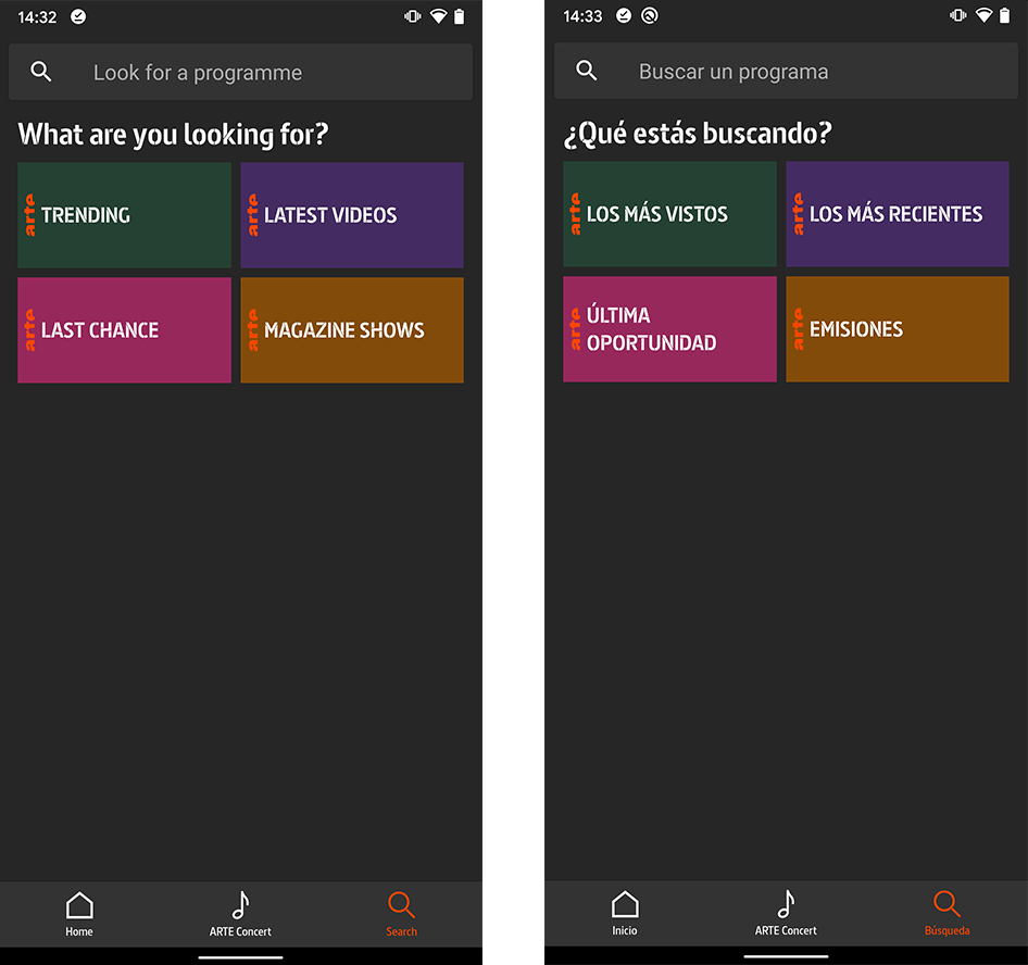
The search page of the ARTE Mediathek app in English and Spanish – the texts for the English filter buttons are shorter and require just one line in each case, while in Spanish there has to be space left for potential two lines. The screen shown is from a Pixel 2 XL, which is comparatively big. On a smaller screen, such as of a Pixel, space might not be enough for two lines, so truncation might be inevitable there.
I want to create a consistent UX across all my mobile platforms. Where do I go for variation and where is uniformity more appropriate?
Consider the context and differentiate between devices: If someone is using a tablet, don't use the word “phone”, and don’t show tablet graphics. Use language that is consistent with the platform (tap, flick, swipe, pinch and drag content on a touchscreen, press physical buttons and content that responds to gestures, rotate the device).
Don’t use the same language as, for example, on a website, and pay attention to which platform you are on, iOS or Android. Use platform-specific terms because those are what users are familiar with. Don’t be afraid of variation between platforms, you can build a consistent product image across all platforms by other means.
On the other hand, keep language consistent for actions users can take within your app (e.g., a cancel button should be always named “cancel”, no need for variation in this case).
Established solutions for app translation, such as Phrase, are very helpful for maintaining a consistent pool of terms in different languages because they allow creating and reusing keys for the same action. This way, you don’t have to worry about using different words where the same word would be more appropriate. Changing text also gets easier since you only have to perform this in one place.
Mobile devices are often used on the go or as a second screen. This affects user attention. How can I support short and quick uses of my product?
Especially on small screens and on devices that are used on the go, all actions should be clear to users at first glance. That means titles should be short and specific. Together with other design-specific factors, an action-specific title indicates that a button is interactive and not just a title or hint.
Use action words (verbs or short verb phrases) that describe the action to be performed (e.g., move, select, delete, etc.) for interactive elements and commands.
Avoid yes/no dialogs in order to avoid confusion for users. A button should just say what it does without requiring the users to remember previous screens and interactions.
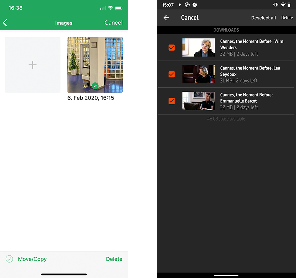
Another example from the BNP Paribas Real Estate GmbH QuickForm iOS app. In the edit mode, photos can be moved from one site inspection to another. The actions are clear (move/copy clarifies that the photo will be copied to another site inspection and will also remain on the previous one, i.e. it won’t be deleted). There are no unclear yes/no dialogs, every button executes the action of the label. The second example is from the download feature of the ARTE Mediathek app. The actions available are clearly labeled: videos can be selected/deselected and deleted, or the action can be canceled.
Space is a rare commodity on mobile devices, esp. on smartphones. Are there tricks to use it more efficiently across different languages?
The easiest thing to do is to use icons instead of text in navigation bars. Icons are universally understood and remove the need to translate text in different languages, while simultaneously saving space. In addition, they are a great way to add a personal touch to the design and to create a consistent brand experience across different platforms and languages.
Also, consider all the space that your app provides. You can use empty states, placeholders, and search fields to provide instructions to users for specific features. If your product, for example, offers the possibility to put items on a favorite list, the list’s empty state could show instructions for this feature. Once users understand how a feature works, there is no need for instructions anymore, as space is filled. In the same spirit, you shouldn’t use a separate label to describe a text field when placeholder text is sufficient.
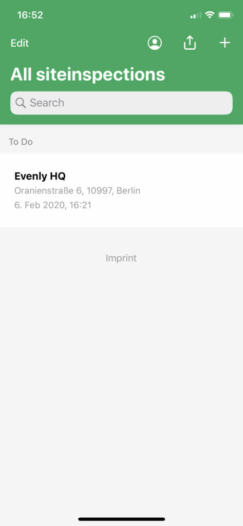
The BNP QuickForm app uses the search field to make it clearer for users, what this field is for. The profile button in the upper right corner opens the user profile without having to spell the word profile out in the different languages that are supported by the app.
My app uses push notifications and other alerts to provide information to users. How do I avoid too much noise while keeping users informed?
Be careful when integrating status notifications and other types of feedback into your interface, and use your powers sparingly, so as not to annoy your users. They should be able to get important information without taking action or being interrupted.
Consider displaying status information in the toolbar. This is an unobtrusive place where users can see the alert, but still choose to follow up on it later. Keep alerts short and use detail view for more text so users can choose themselves if they need additional information or not. This also allows you to translate the content into “longer” languages and keep all information needed, e.g. having just a short meaningful title and having more information at user request.
Optimize the alert text so it reads well in any orientation without scrolling, and don’t forget to test this in all languages that your product offers.
Avoid unnecessary alerts and create the possibility to customize alerts within the app. This way, users can not only opt out of all alerts, but be more selective.
Use system alerts in order to create a seamless user experience on the respective platform. Here, it is better to adhere to the platform customs than to create something completely new, as it might look out of place and confuse users.
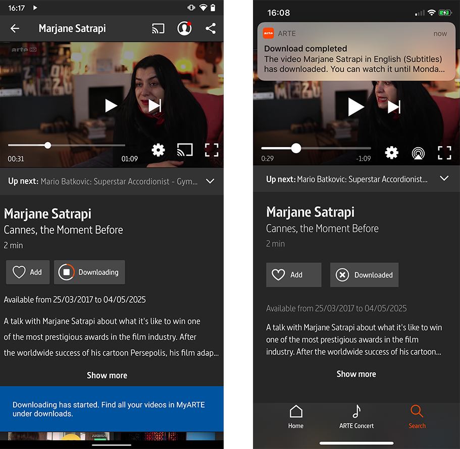
The ARTE Mediathek app on Android shows an alert when a user starts downloading a video. This alert disappears again. At the same time, a notification badge appears on the MyARTE icon, because the downloaded videos can be found on the MyARTE page. This notification disappears when the user has visited the page. This way the notifications and alerts help users navigate but disappear when they are not needed anymore. The same happens in the ARTE Mediathek iOS app, only with an iOS-specific alert.
I want to make my app as accessible as possible for a wide range of users. What do I have to consider and what resources can I use?
Think about accessibility from the beginning so it’s easier to integrate it into your product, instead of adding it to your features later on. Try to consider the needs of all people who may use your app – for some, accessibility is a necessity; for others, it is practical. For example, closed captions can be necessary for someone who has trouble hearing, but also useful for someone watching a video in a noisy environment. Also, accessibility features are very helpful for people who are learning a new language.
No matter if you stick to iOS or Android, both offer a lot of platform-specific support to help you with adding accessibility more quickly and in a way that is consistent with your platform. On iOS, you can use features like VoiceOver, Switch Control, and AssistiveTouch, whereas Android offers you TalkBack, Switch Access and Select to Speak.
To get a first overview of what you can improve in your app, use Google’s Accessibility Scanner for Android and iOS (yes, they developed one for the other mobile platform as well).
When developing accessibility features for speech, you should pay special attention to texts. Written text often appears shorter than spoken words. So should everything be read out loud? Or only certain passages? Which abbreviations are useful? Let users skip text and content easily when in VoiceOver mode. And, of course, you should test speech features with users in their respective language.


