As designers, we want to give our iOS app users joy. We do this by conducting user research and empathizing with our users’ desires as we iterate on our apps’ designs. However, we often begin to consider iOS internationalization a bit late in the development cycle. This can lead to rushed design decisions as we, for example, fix labels that break layouts in a language we didn’t anticipate. We can do our users one better by being proactive about i18n and its impact on our designs.
And that’s exactly what we’ll do in this guide. We’ll use the popular design app, Sketch, but we’ll be just as interested in the design problems emerging from Sketch iOS internationalization, and potential solutions to them. So even if you use Adobe XD, Illustrator, PhotoShop, Figma, Invision, or another design app entirely, come along with us. I think you may learn a couple of things about designing for i18n along the way, and that can only make you a more well-rounded mobile app designer.
🗒️ Note » With the Sketch integration for Phrase Strings, the software localization solution within the Phrase Localization Platform, we can actually use real translations provided by real translators in our designs. We’ll cover the integration in greater detail a little later here.
Our (mini) project: Discounter
Let’s assume we’ve been tasked to design a discount-finder app called Discounter. Discounter targets price-conscious retail consumers and aggregates city coupons, flyers, and sale information for these users in one place. Our users can then browse and search for their favorite products to see if they’ve been discounted.
We’ll assume that we’ve done some research, tested a low-fidelity prototype, and have a good idea of some flows and interactions we want to use in our app. We’ve found that our Feed screen—which shows a reverse-chronological ordering of the most recent products on sale in the user’s city—is best served by the following design so far.
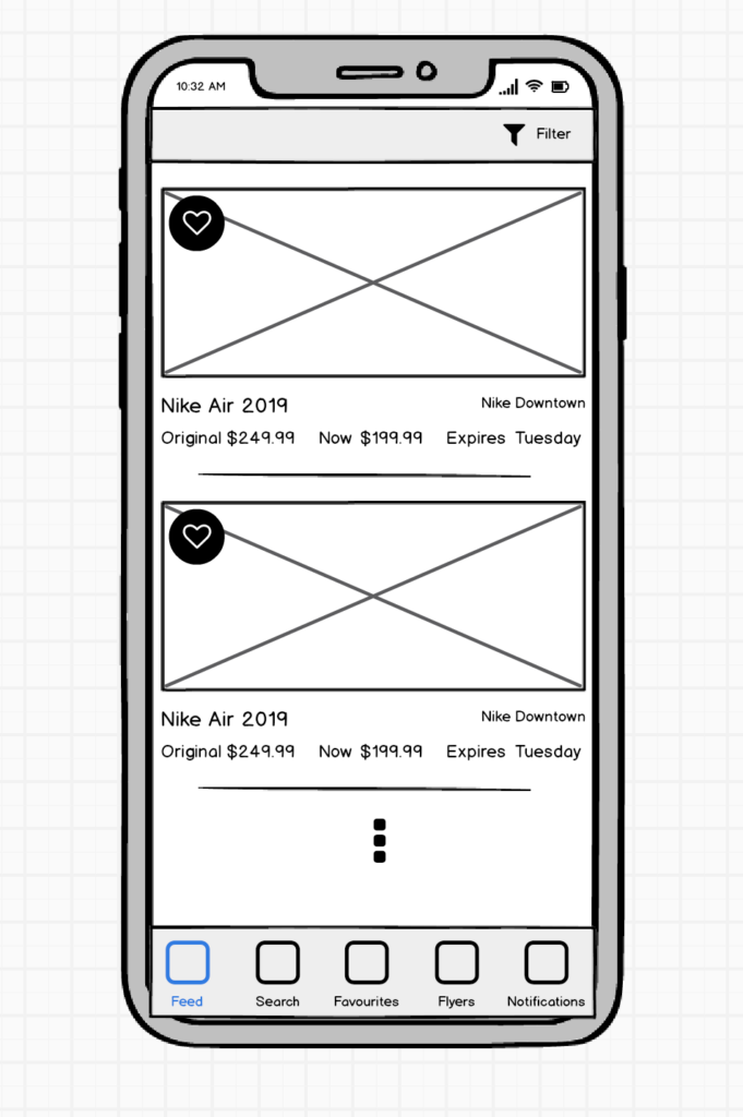
A lo-fidelity wireframe of our Feed screen
For brevity, we’ll focus on this screen in this article. The next step is to make a high-fidelity mockup of this screen that can be given to engineers for building. We jump into Sketch, get to work, and come up with this.
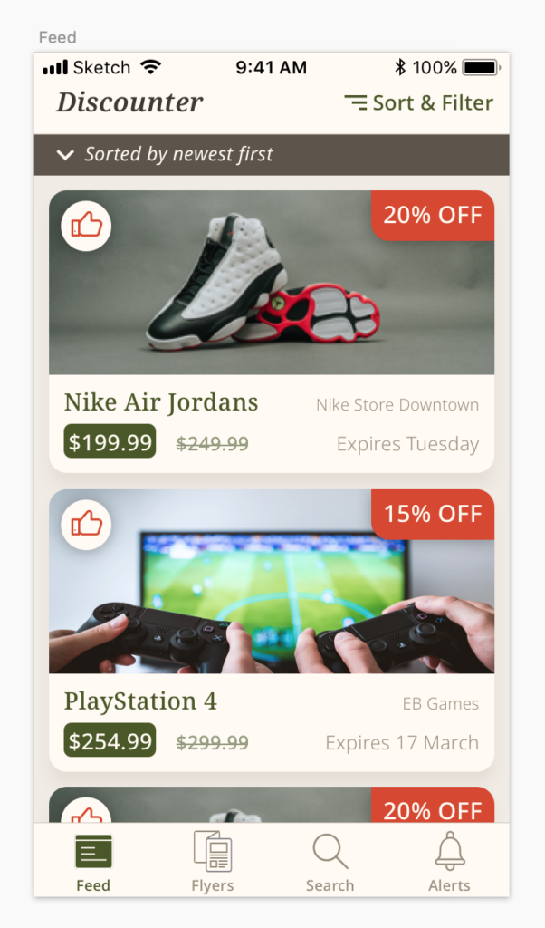
Sketch mockup of Feed screen
🗒️ Note » If you want to work along with us, grab the project GitHub repo, which contains the Sketch file displayed above. Just open Starter_Discount_Finder_App_Mockup.sketch and you’re good to go. If you want to see the completed project that we’ll reach by the end of the article, open Completed_Discount_Finder_App_Mockup.sketch.
This mockup is a good start, but we could do better. Let’s start identifying and fixing some of the i18n issues in our design.
Photo and icon credits
Some photos and icons were sourced for the mockup above. Here’s a list of these sourced assets, along with the awesome people who provided them for free.
- Feed (Menu) Icon by Jardson Almeida, US on The Noun Project
- Search Icon by Landon LLoyd on The Noun Project
- Alert (Notification) Icon by DewDrops on The Noun Project
- Thumb Icon by Ayub Irawan, ID on The Noun Project
- Nike Air Jordans Photo by Hermes Rivera on Unsplash
- PlayStation 4 Photo by JESHOOTS.COM on Unsplash
The color palette used in the mockup was largely derived from the Smashing Magazine Wallpaper, Let’s Get Outside, by Lívia Lénárt.
The need for internationalization (i18n)
We’ve been told by our product manager that our app will launch in five different regions simultaneously: North America, Europe, the Middle East & North Africa (MENA), India, and China. This means that our design will have to accommodate scripts other than Latin. We should also keep in mind language direction since Arabic, Hebrew, and other languages are written right-to-left, and their respective layouts flow in that direction. And we’ll have to mind our label widths as well since a word or phrase in English can have a relatively long translation in another language.
🗒️ Note » A script is a set of characters that can be used for one or more languages. The Latin script, for example, is used for many languages including English and French. The Arabic script is used for Arabic, Urdu, Farsi, and more.
Typography: Selecting fonts for supported languages
To best control our typography, we want to make sure that the font/fonts we select cover our supported languages. In our case, there are a large number of scripts we have to support: Latin, Arabic, Chinese, and more. When selecting fonts for our design, we have two basic options:
- Select a font that covers all our supported scripts
- Select a group of fonts, a font stack, with each font in the stack covering some of our supported scripts
Given that it meets our aesthetic goals, the first option can sometimes work for us. Of course, the one font we choose must support every single script we need. If we’re supporting a few scripts, this can be feasible.
Otherwise, we need a font stack, i.e. we’ll mix and match fonts that work together to cover all of our supported scripts. This takes a bit more work upfront but gives us a lot of flexibility. Since we’re covering a lot of scripts, we’ll be going with the font stack here. We’ll get to our font selection in a minute.
🗒️ Note » We fully acknowledge the distinction between the terms “font” and “typeface,” but for practical reasons, we will stick with using “font.” Thank you for your understanding.
Using font book to test fonts
In all cases, it’s best to test our font selection to make sure it supports the scripts and languages that we’ll need in our app. One way to do this in macOS is through the built-in Font Book app.
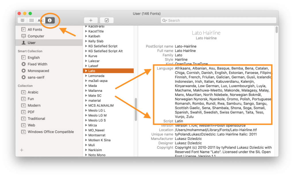
The Info (ℹ︎) tab in macOS’ Font Book app can indicate a font’s supported languages and scripts
🗒️ Note » You can also use Font Book’s Search bar to filter fonts by a particular language. Enter “French”, for example, to see only fonts that support it.
Font Book gives an idea of the supported languages, but it’s not bulletproof. A font’s metadata could be inaccurate or out of date. So we should test our selected font(s) in more concrete ways before committing to them.
Using Sketch to test fonts
To shed some doubt regarding a font’s support for our languages, we can test it directly in Sketch. Doing this is pretty simple. We select the text in a text layer, and make sure that it’s using the font under test and that it’s written in the language under test.
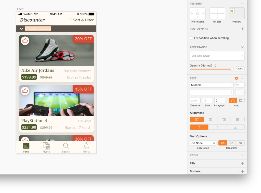
Take a look at the Text section of the inspector while you’re testing a text layer
As we change the copy of a text layer to test different languages, we should keep an eye on the contextual Inspector pane in Sketch. The first dropdown in the Text section will reveal the currently set font. If this is reading “Multiple” or a font other than the one we set ourselves, then the font we set may not support the current language.
For example, notice that in the screenshot above the text layer we’re using to test Arabic has its font set to “Multiple”. This means that we’ll probably need to use a different font, one that supports Arabic script or add an Arabic-supporting font to our app’s font stack.
🗒️ Note » Certain scripts can act funny in Sketch if you add character spacing to them. I find it best to set the Text > Character spacing field to zero (which sets it auto) in the inspector when testing a text layer in multiple scripts.
System fonts
While not exactly overflowing with personality, using system fonts oftentimes alleviates the pain of creating a multilingual font stack. Operating Systems like Android and iOS are made to support almost all locales on Earth so their default font families usually support all the languages we need in our apps.
To use iOS system fonts, simply download them from Apple and install them on your machine. They’ll then be available for you to use in Sketch and other apps.
🗒️ Note » Even though Font Book may tell you system fonts don’t support your language, they may well do, perhaps by falling back on a compatible alternate font. Test them in an iOS app yourself to make sure.
Google’s Noto fonts
Our mockup is currently using Google’s Noto Serif and Noto Sans fonts. Google’s Noto fonts are made by the Internet giant with the goals of supporting all languages and working together harmoniously. Noto Serif and Noto Sans come with a good amount of style variants, and both cover a set of 500+ languages!
While these base Noto fonts cover an immense number of languages, they don’t cover all of them. For example, Noto Sans and Noto Serif don’t cover common scripts used in the Middle East and North Africa, such as Arabic and Berber. We can search for a particular language on the Noto page to see which Noto fonts support it.
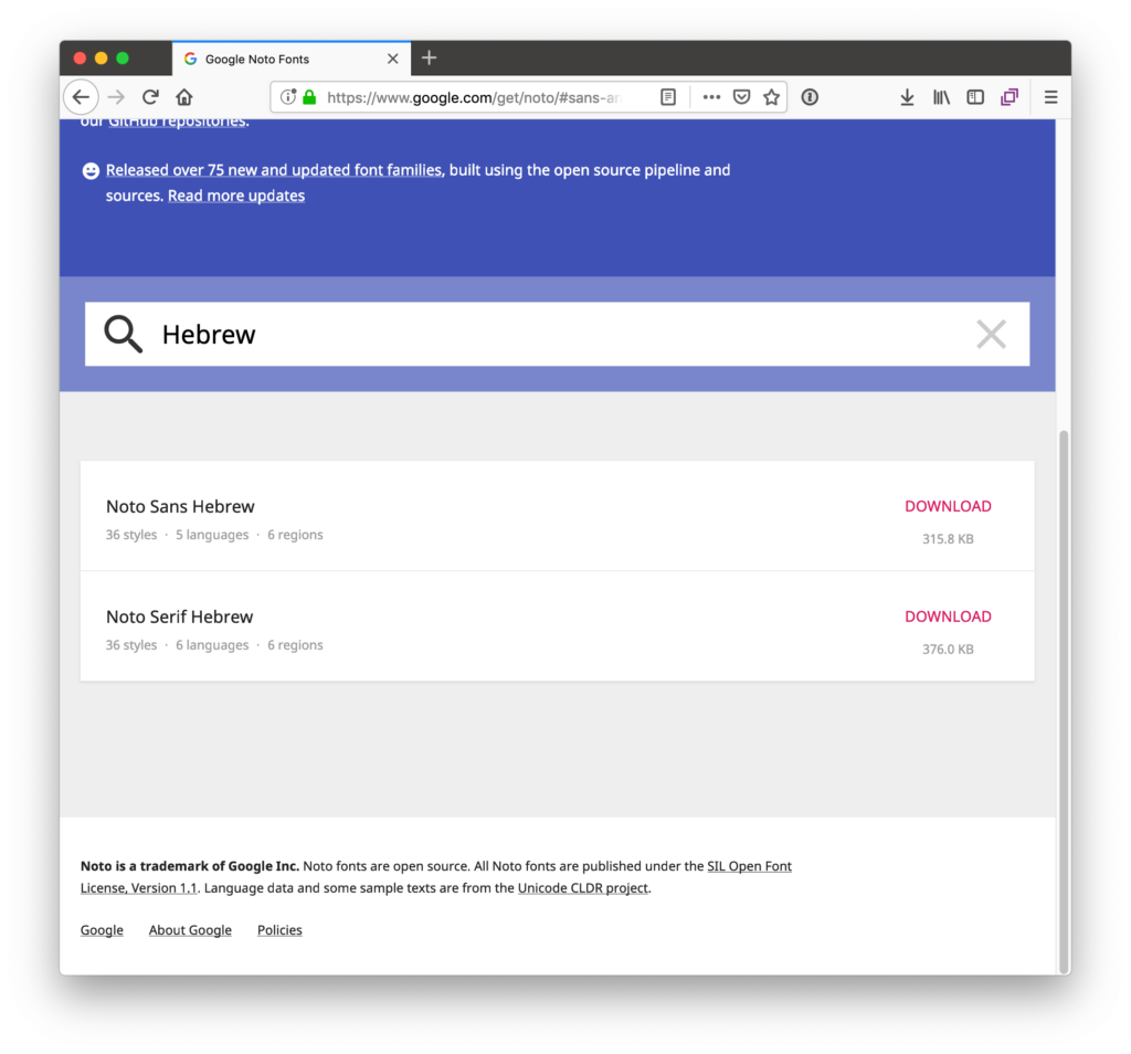
Since our app is to be deployed in the MENA region, we will need to add some fonts that support Arabic and Hebrew. We’ll use Noto Kufi Arabic, Noto Sans Arabic, Noto Serif Hebrew, and Noto Sans Hebrew to round out our font stacks. Here are the two stacks we’ll use:
- For headers and display text, we’ll use Noto Serif, Noto Kufi Arabic, and Noto Serif Hebrew
- For body and UI text, we’ll use Noto Sans, Noto Sans Arabic, and Noto Sans Hebrew

A side-by-side test of the vertical alignment of our font stack
One of the biggest benefits a font family like Noto gives us is that it allows us to mix and match different Noto variants without worrying about breaking the layout. For example, when we set a label with a Noto font to a particular font size, we can be confident that switching that label to another Noto font won’t break our layout on the vertical axis.
🗒️ Note » You may have noticed in the above image that we have overflowing labels and that our right-to-left languages have left-to-right layouts. We’ll get to these issues in just a moment.
🗒️ Note » I’ve used Google Translate for some of these translations. And for Amazigh, I just typed jibberish, since I couldn’t find an Amazigh translation tool. I probably could have avoided all of this if I used the Phrase Sketch integration (more on that below) since the integration along with Phrase would have allowed me to get real translators to provide me with the translated text I need.
Designing for variable text width
Even with our increasing mobile phone screen sizes, real estate on mobile is a precious commodity. And translations of the same phrase in different languages can significantly vary in length. This is a recipe for text labels getting truncated and causing users to miss information, or get annoyed because our interface looks broken to them.
Testing layouts for i18n in Sketch
We can catch potential i18n layout problems before they happen by testing our layouts during the design phase.
Using Phrase’s Sketch integration
Nothing beats testing out layouts with the real data that we want to use in our production app. To make this quick and easy, Phrase has released a Sketch plugin that allows us to pull text provided by our translation team directly into our Sketch designs. Given that we have a Phrase account with locales set up at the ready, we would just need to install and quickly configure the Phrase Sketch Integration. We then get access to a simple menu that allows syncing our design’s text with text provided by our project translators, or machine translation. The integration’s menu also enables us to switch languages on the fly to test our design in different locales.
🗒️ Note » If you haven’t worked with Phrase before, you’ll find it’s pretty straightforward to get started (for free). You can also check out the getting-started guide for basic instructions. You can try the integration, along with other awesome Phrase features, by signing up for a free 14-day trial.
The basic workflow of using Phrase in Sketch designs is as follows:
- Pushing the current design text in some source locale to Phrase via the Push Translations menu command
- Getting our translators to translate the text on the Phrase web console into our target locales
- Pulling the translations back into our design via the Pull Translations menu command
- Switching our language over to a target translation to test our design in that locale
After our translators have translated the design copy to Arabic in the Phrase web console, we can switch our Sketch design over to Arabic to test it out. For a right-to-left language like Arabic, it’s a good idea to flip the horizontal components of the design when testing. This provides a more accurate view of what our production app will look like in Arabic. We’ll look at language direction and right-to-left languages in more detail a bit later on in this article.
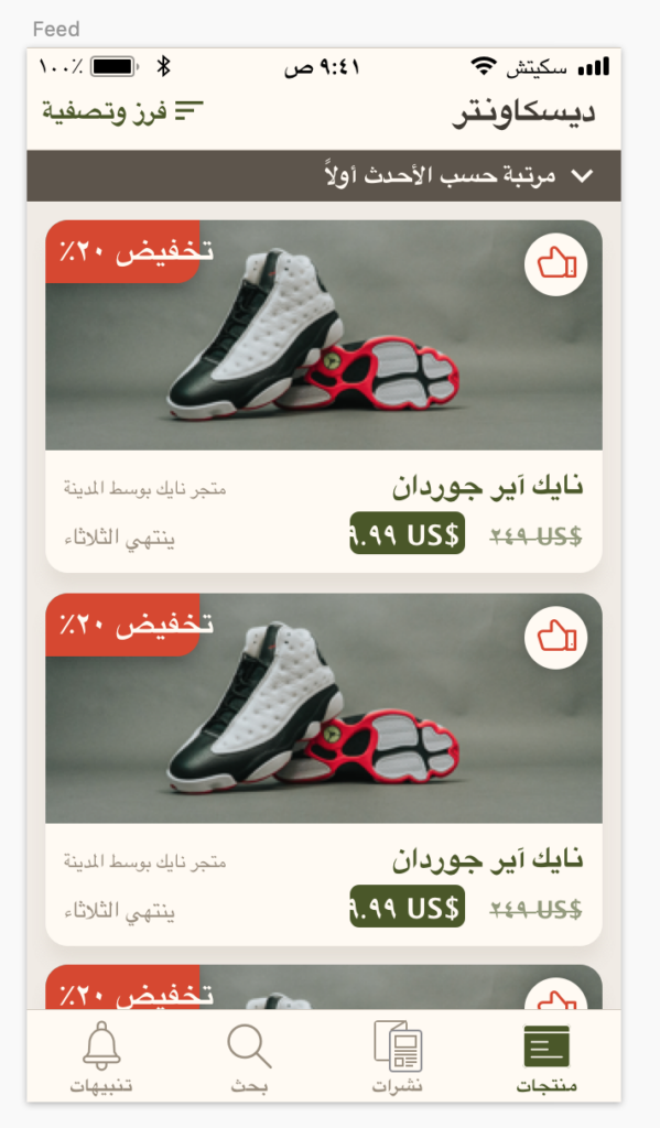
Identifying layout problems in Arabic with the Phrase Sketch integration
We can already tell that some of our layouts just aren’t optimized for Arabic. We’ll have to take care of that, and we’ll do so a bit later on here as we continue to test and refine our design. With Phrase’s Sketch integration, we were able to get ahead of our layout issues and know about them during the design phase, saving time and money and giving us control over the designs before they head over to developers.
Using the psuedol10n integration
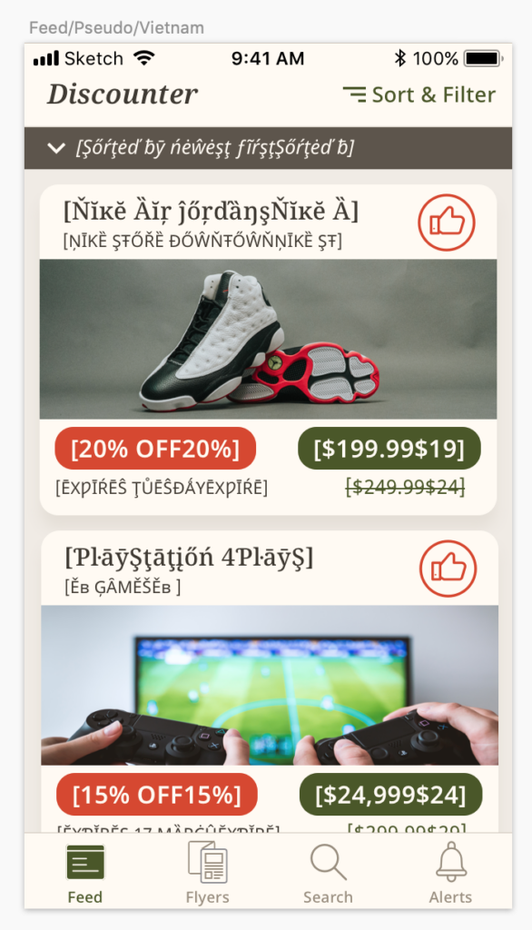
Of course, we could just manually add a lot of text to each of our text layers and see where our layout breaks. However, this could be a bit tedious. Luckily, Arie Aulia Nugraha has created a little plugin for us called Pseudol10n, which we can use to test for variable text width. Pseudol10n converts an artboard’s text layers to pseudo-Thai or pseudo-Vietnamese. The latter expands text layers by 35%, which helps us test overlaps and layout breakage.
After installing the plugin, we’ll have a new Sketch menu command: Plugins > Pseudol10n > Psuedolocalize to. We can run the new command after selecting an artboard. We’ll be asked to select Thailand or Vietnam. I prefer Vietnam since it extends text layers more than Thailand. Selecting either one will create a new artboard with what seems like gibberish text.
🗒️ Note » The Psuedol10n integration only works if the target artboard’s text layers are not inside symbols. If our artboard is using symbol layers that we want to test, we have to detach those layers from their respective symbols. We can do this by creating a copy of the artboard and detaching the copy’s symbols. We can also create a copy of the entire Sketch file, open the copy, and delete all its symbols; this detaches all symbol layers in our artboards.
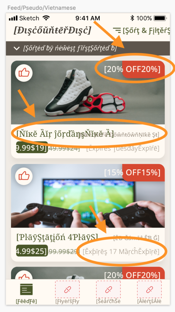
Identifying layout problems using the Pseudol10n integration
After running Psuedol10n on our artboard, we can see a few potential problems:
- The width of the “20% off” label can overflow its background
- The product name and store labels can potentially overlap
- The before and after price labels can potentially overlap
- The expiry label can get a little too close to other labels on its row
Achieving dynamic padding with the Anima integration
We’ve revealed through testing that our red “% off” label doesn’t expand to fit its content. While this is often acceptable in static mockups, we can easily fix this right in Sketch using an integration. There are a few dynamic padding (or “dynamic button”) integrations out there that can help us with this. My personal favorite at the moment is Anima, which is a general-purpose responsive layout and prototyping plugin.
After installing Anima, we get a little panel in our inspector pane.
The Anima integration inspector panel
In our product card symbol, we select our label’s layer group, which contains the text layer and the background rectangle. We then use Anima’s PINS to anchor it to the top-right of its parent. This will keep the group fixed to that corner as it resizes. We can then click the ➕ button in the PADDING area of Anima to enable dynamic padding.
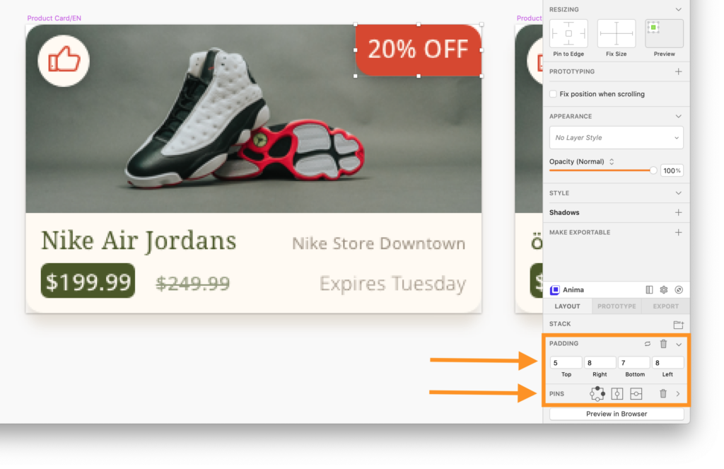
Pinning and padding using Anima
We should also make sure that our inner text layer has a centered horizontal alignment and is set to auto-width (not fixed). Setting the text layer to auto-width will allow it to expand and grow as its text changes.
With that in place, our label will expand and contract naturally as its content size changes. And since we made these changes at the symbol level, all our product cards get this benefit at once.
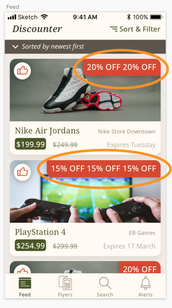
Our label expands and contracts according to its content
Avoiding overlap by adjusting the layout
The remaining issues that we identified were overlapping labels and labels that could get too close to each other. There’s no magic bullet for addressing these types of issues. It will depend on what makes sense for our current interface. One strategy we can utilize for solving our overlap issues is to move labels to their own rows. We have to balance this with the need to keep our cards from being too tall. Here’s one redesign of our product cards that can alleviate some of our problems.
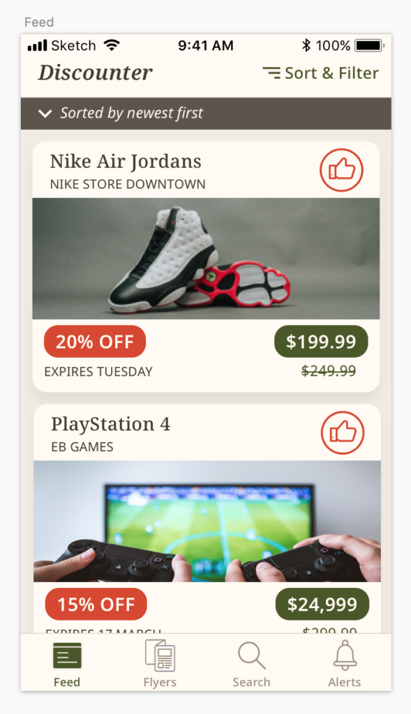
Our updated design
Testing our updated design reveals that it’s better suited for variable-width text
While not perfect, by moving things around, we achieved a design for our product cards that is much better suited for variable-width labels. Doing this at the design stage gives us a lot more control over the UI as we consider i18n. Our updated design gives us the added benefit of not covering up the product image with other UI elements. Nice 👍🏽
Working with right-to-left languages
It can be worth our time to do some testing with right-to-left (RTL) layouts if we know that we’re supporting RTL languages. For example, we can test our product card to see if it works in Arabic and Hebrew when we flip the layout direction.
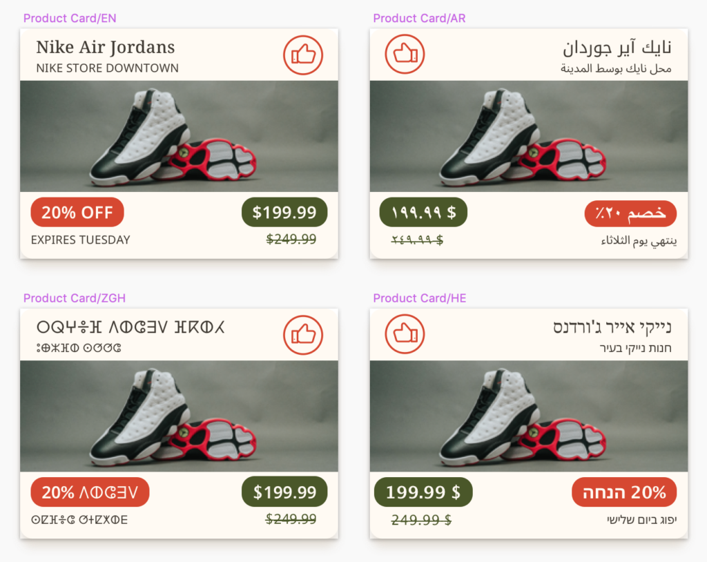
A test of our product card in different layout directions
🗒️ Note » The Anima integration’s Stack feature can come in handy while flipping elements on the same row. We can put all elements in a row in a Stack and pin the Stack layer itself appropriately. Then we can drag elements on the canvas and have them automatically pop into place in the Stack. This can save a bit of time when testing RTL layouts.
🗒️ Note » It’s often a good idea to flip directional icons when testing RTL designs. Notice, for example, how the thumb icon is flipped horizontally in the RTL artboards above.
Highlighting and i18n
You may have noticed that our sorting indicator is in italics.
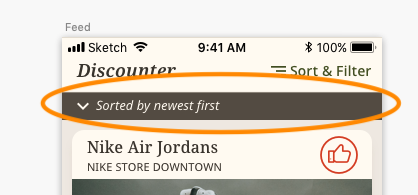
Italics can be a problem for i18n
This can be an issue when localizing to languages that don’t have italics, like Arabic, for example. It’s best to use bolding or color highlight to achieve a more universal text highlighting scheme.

Bold highlighting covers more languages than italic
🗒️ Note » You can get the completed mockup from this article’s companion GitHub repo. Just download or pull the repo and open Completed_Discount_Finder_App_Mockup.sketch.
Wrapping up our localization tutorial with Sketch
We hope that you’ve learned a few things about designing in Sketch with i18n in mind. Considering i18n at the design stage of app development gives designers more control over how to solve potential problems that can arise as an app is getting localized. This makes designers proactive—rather than reactive—allowing them to create i18n-aware designs that delight users in different parts of the world.
If you’re working with a whole team of designers, developers, translators, and more, and if you want a more organized and efficient localization workflow in app design and development, check out Phrase Strings, the dedicated software localization platform within the Phrase Localization Platform.
With its robust Sketch integration, Phrase Strings makes using real translated data in your designs a breeze. It tracks translation versions so that your translators can easily go back to older ones. You can even do over-the-air translation updates with Phrase, so your translations get to your users immediately without waiting for an app update.
Check out all Phrase’s solutions for designers and take your multilingual UX design to the next level.

