As more and more businesses go international, our approach to software is becoming increasingly intertwined with good internationalization and localization practices. And the written word is still a primary element of our products’ UIs. So it behooves us as software professionals to consider good typography practices as we do the work of localizing apps and websites.
In this article, we’ll delve into why typography is so important for our localized products and the people who benefit from them, our users. We’ll also explore some of the foundational elements of selecting fonts for international apps and websites. Specifically, we’ll look at how to choose different fonts that work together. And we’ll address font selection from a practical perspective, and an aesthetic one that relates to brand personality and feel.
Why Fonts Matter for Localization
Ask any good graphic designer and she’ll tell you that typography is the core of any user interface. In fact, Jef Raskin, pioneer of the Macintosh project at Apple – yes, the first commercial graphical user interface in the world—believes that a designer should start designing with text. I read this in the fantastic book, Designing Products People Love: How Great Designers Create Successful Products. In it, Scott Hurff, author and ex-Tinder product manager and lead designer, dedicates a whole chapter to the importance of the written word in UI. If you’re a digital product designer you owe it to yourself to read Hurff’s book: it’s a product design goldmine. But why do top-level designers care so much about text? And how does this influence font selection?
Text is Still Tops in UI
While an increasing amount of the digital content we consume today is visual, images and video, text is still crucial in our digital products. Before we identify an app icon with its app, we need to read the app’s name underneath it first. Navigating most software requires jumping from one piece of text to another. Hover over an icon button in any well-designed piece of software, and you’ll get a tooltip that explains what the button is used for. Text is still one of the primary forms of communication between a product designer and its user, and we can rarely design good digital products without it.
The Importance of Good Font Selection
When considering fonts, the main difference between a good one and a bad one is legibility. Can the font be read at different sizes to support different contexts? Is it readable on screens with different resolutions? The whole point of our products’ copy is communication, so the fonts we select for our UIs should read well everywhere our products are used. Font readability has a direct effect on the usability of our apps and websites.
Fonts also communicate personality and are a core component of our product branding. Fonts solidify brand identity, and good typography can inspire a sense of confidence, professionalism, and trust in our product.
That’s all good and well, but we’re here to talk specifically about localized products. Let’s get to that.
How to Choose Fonts for Localized Products
There is a bit of science when deciding on what font to use for the localization of a mobile app. We have to consider the languages we’re supporting, of course. Diacritical marks, like accents, also come into consideration. Font styles and height come into play as well. And we could just do away with all of this multi-font stuff and select one font for all our languages. Let’s take a look at these practical criteria for selecting fonts across locales.
Locale Support
One of the first things we need to determine when selecting fonts for our software is the languages we need to cover. This seems obvious, yet there is some nuance that can help us when we’re selecting our fonts for different locales.
How to determine the languages that a font supports will be different depending on our toolset. macOS users can use the built-in Font Book app to get an idea of a font’s supported languages. Google Fonts provides a Languages dropdown that can filter the visible fonts to ones that only support the selected language.
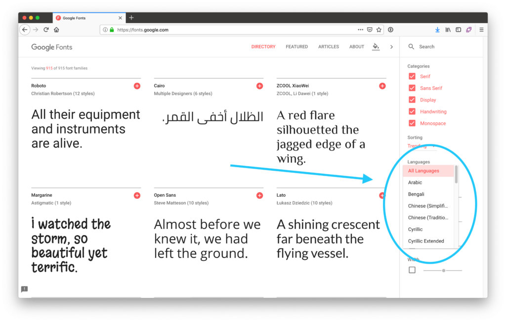
Google Fonts provides a selector that helps us determine languages support for fonts
If we (or our clients) are paying for a font, we should check to see if our font supplier gives us the ability to determine what languages a given font supports. Adobe Fonts offers a language-filtration function similar to that of Google Fonts.
Considering Diacritical Marks
Of course, we will have to test our fonts ourselves before using them in our apps and websites. When we do, we should check to see if diacritical marks, like accents, are supported properly in our fonts. Missing diacritical marks in languages that use them can often change the meaning of words, which is less than desirable.
Font Styles
If we’re using bold or italic styles for highlights, we need to make sure that our selected fonts support them for our chosen languages. It’s actually best to avoid italics altogether since some languages like Arabic have no support for them. In all cases, we should check to see if the fonts we’re using support the styles we need for all our covered languages. Alternatively, we could avoid style variances and use color to highlight our copy.
Font Height
If we’re selecting different fonts for the different languages our software supports, we need to look at the characteristics of our fonts to minimize the chance that our UIs will break in different locales. One of the most important of these characteristics is font height.
The highest point of a font, including diacritical marks, is called the ascent line. Ideally, our selected fonts should have the same ascent line. Otherwise, our UIs’ vertical spacing may need to be adjusted for every language we support. Similarly, the lowest points (descent lines) of our selected fonts should match.
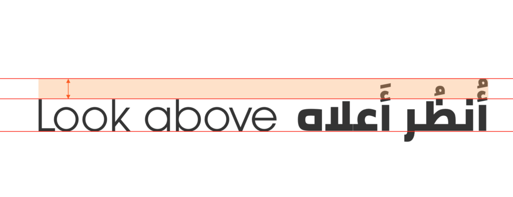
Layout breakages can occur in our UIs if ascent lines don’t match
One Font to Rule Them All
A relatively simple approach to font selection is picking one font that covers all our supported languages. This approach can be a bit utilitarian and lacking in personality. However, if our selected font does match our brand, this approach can save us a lot of time and effort.
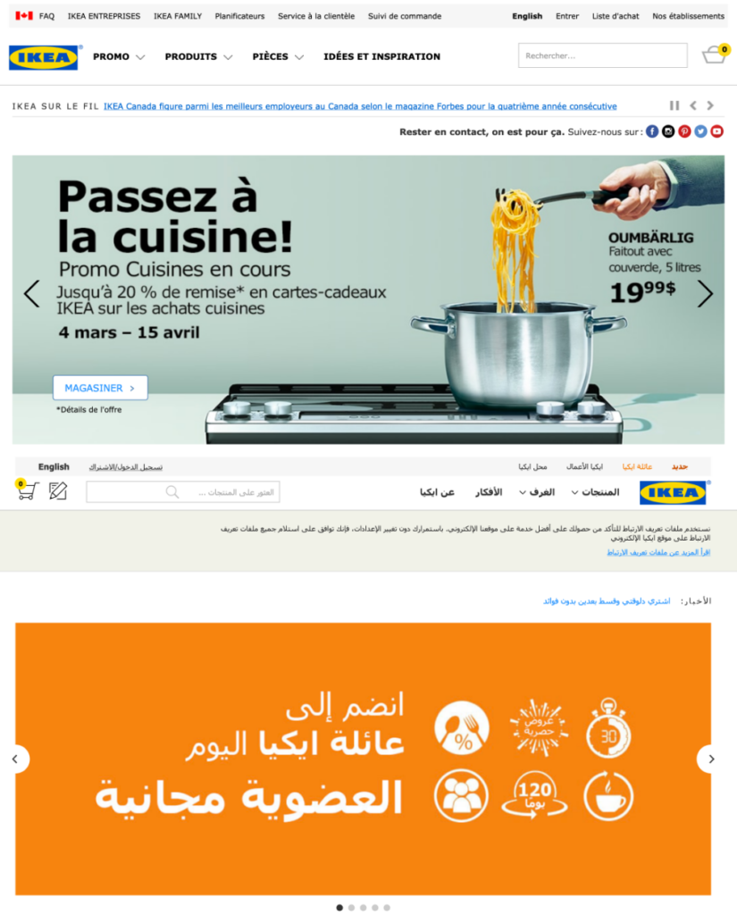
For its many supported languages, IKEA uses Tahoma, a font that matches IKEA’s utilitarian brand.
Google Noto Fonts
One option for the “one font” solution is Google’s selection of Noto Fonts. While technically a family of fonts, Noto typefaces are designed to work together practically and aesthetically and cover a large variety of languages.
Aesthetics
Sometimes we need fonts that have a distinct personality that matches our brand. In these cases, we want to match the look and feel of the fonts we select across languages.
Line Weight
The overall thickness of a font’s lines plays a big part in the feeling it conveys. A thick font can be bold and in-your-face, while a thinner font can be elegant and chic. And when we pick different fonts for different languages in our websites or apps, we need to maintain a consistent line weight across them.

Avenir Roman (Latin) and Cairo (Arabic) have similar line weight
Feel
Is our brand fun and playful or professional and mild-mannered? This will help determine our font selection. And while our main brand font may have already been selected, we can better match fonts for other languages to it if we can lock down its feel.

Both Monsterrat (Latin) and Tajawal (Arabic) have an elegant, rounded look that conveys warmth and professionalism
Signing Off
Are you working on an internationalized software product? Well, consider joining a number of international companies in using Phrase for your internationalization and localization needs. Made for developers, managers, and translators, Phrase has everything your team needs to deliver translations in your technology of choice – all in a streamlined, people-first workflow. Take a look at the robust product set Phrase offers, or give it a spin yourself for free.
In a world where everything under the sun has an app or website, we want to be more competitive and reach more people than ever before. Selecting the right fonts for our products as we internationalize them can mean the difference between brittle layouts and ones that work well across locales. And if we go the extra mile (or kilometer), we can select fonts that work for our languages while maintaining the design language of our brand. I hope you’ve learned a couple of things about font selection for i18n here. Til next time 👋🏽

