Localization strategy
UX Localization: Adapting the User Experience for International Audiences

A visually appealing app is hardly worth anything without a strong user experience (UX). This is why UX design appeared on the tech map in the first place. However, what's relatively new is UX localization—the skill of adapting UX for different markets.
Giving users the feeling of comfort, familiarity, and ease of use in whichever corner of the globe they may be is what helps the world’s most popular apps such as Facebook or Airbnb stay popular—and profitable. The good news? You can do it too.
UX localization is about much more than just UX design. It’s about crafting cross-cultural products with international UX in mind from the start of the development process. Let’s explore how you can also build the impact of localization on UX into your app.
What’s user experience (UX)?
App user experience is all about how a person perceives, thinks about, and interacts with an app, be it web or mobile. It encompasses a variety of elements, from the design and the user interface (UI) to the app’s documentation and how it responds to a user’s behavior.
UX is typically the one thing that makes or breaks the success of your app—if users don’t see value in your app, or have fun using your app, or get something out of it that they appreciate, they won’t use it. Your software will become shelfware. All the days you spent coding and testing will have been for nothing.
It could also be the case that your app is technically perfect, but only for the users in your own country. The moment your app becomes international, a whole new set of challenges arise. That’s when UX localization comes in.
What isn’t user experience?
Before we talk more about international user experience, let’s address a few things that user experience is not. UX isn’t:
- A marketing or UX specialist’s only responsibility, or a touchy-feely domain involving users “on the other side of the wall.”
- A vertical slice of the whole product, or something you do after you’ve finished building your app.
- Visual design or making things look pretty. A visually pleasing product can still have poor UX.
- A gut feeling that you get while using your own app. UX designers apply user research, data, user testing, and analysis before they make any decisions.
- Web development. While coding remains the technical foundation of any app, UX is about anticipating how the user will interact with that code and designing the experience accordingly.
- Just for the users in your own country. UX has international implications, too, as culture and language play a prominent role in shaping how your users think and behave.
UX localization: Adapting user experience to local expectations
It’s common to think of app localization as simply replacing your app’s text strings with words in another language. However, what localization truly means is:
- Fitting your app’s content to the cultural tastes and usage habits of the target market rather than performing a word-for-word translation
- Using the correct number conventions and currencies
- Adapting the user interface to the different space requirements of each language
- Verifying the cultural appropriateness of graphics, visuals, colors, and icons
- Adapting your app’s UX to what’s expected locally, i.e., tailoring the experience for international users according to regional norms, expectations, thought processes, and language.
The last point is where UX localization comes into play, and where developing empathy with your users is essential. You need to be able to understand when something can detail the user experience for native speakers—even if it looks like a small detail from a non-native speaker’s point of view.
When all departments—Development, Marketing, Product Management, Design, etc.—work hand-in-hand, they can design and develop outstanding apps. Combining efficiency in coding with excellence in user experience, these apps can boost sales, user adoption, and customer loyalty wherever in the world they are made available.
UX, UI, and usability in app localization
To position things properly for what follows, let’s see why UX, UI, and usability are different. Of the three, only UXencompasses the whole range of impressions, feelings, likes, or dislikes that users have when using your app.
That doesn’t mean the UI and usability aren’t important. The UI must offer access to functionality that’s of value or of interest to the user. The app and its UI must also display good usability by being clear and simple to use, pleasing to the eye, easy to learn, and efficient (as in the minimum necessary number of taps, swipes, or clicks) in taking users where they want to go.
UX groups together the quality of the UI and the level of usability, and then adds further aspects: For app localization, for example, this includes the correct use of colors, symbols, backgrounds, and indications of direction (how to navigate a localized page). In short:
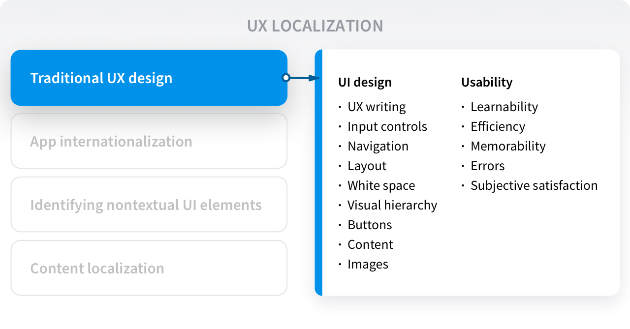
- Usability: How easy it is to use your app, i.e., how well a user in a particular context can use your app to achieve a specific goal effectively, efficiently, and without frustration. The five principles of usability are learnability, efficiency, memorability, errors, and subjective satisfaction.
- User interface: Everything that the user sees and touches, like the touch-sensitive controls—and their layout on a screen—that allow the user to interact with the app’s content and features. Other UI elements include the navigation, the layout, the use of white space, the visual hierarchy, the buttons, the copy, etc.
- User experience: The totality of the user’s feelings, perceptions, and many interrelated cognitions (e.g., beliefs, attitudes, intentions, preferences) about the app that result from the level of usability, the quality of the UI, and the appeal of the content and features.
When you localize the UX, you’re ensuring that international users will perceive your app in the same way as your domestic customers.
Before UX localization: The role of international UX design
When an app is international in scope and the product is available in multiple language versions, it’s important to plan how to cater to international users from the very beginning, long before localization begins.
The internationalization of user experience, also called cross-cultural UX design, is about laying the groundwork for the app or website to meet global users’ needs and expectations. Are they used to electronic wallets? Do they swipe left to go back, instead of right? Do they prefer cluttered screens or minimalistic ones?
These are all things that international UX design takes into consideration. That’s why internationalizing UX design involves more than just making sure that the core functions of your app work across different languages and regions.
International UX design also involves combining usability, UI, and localization best practices:
- For usability, a cross-cultural design could mean letting the user choose which language they want to use instead of imposing a language based on the user’s geographic location.
- For UI, it could mean allowing users to change their own preferences (e.g. to turn on dark mode, to arrange elements as a list or a grid, etc.).
- For localization, a cross-cultural UX design could mean allowing the local currency symbol to be displayed next to the price, not leaving untranslated text in images, and supporting local payment methods.
It can be useful to think of this cross-cultural UX design process as comprising four steps. Let’s break them down.
#1 Ensuring usability in every market
Steve Krug wrote his book “Don’t Make Me Think” to help people think like a usability expert (a large part of creating the UX), even if they have a different job role, like being a developer. He aimed his ideas at web applications, but they carry over naturally to mobile apps too.
Among some of his pithy suggestions are:
- Don’t make people think. People typically don’t want to have to puzzle over apps to get what they want out of them.
- Apps should explain themselves at a glance—from the first screen onwards.
- Don’t waste people’s time. Keep the text short and sweet, and minimize distances over layouts and through menus.
- The back button is good. If people guess, don’t penalize them. Let them back out again easily.
Further care is needed when it comes to app localization. The usability of your app is likely to have been created according to your own cultural norms. However, what may seem natural in one culture may look strange or different in another.
For example, this conceptual difference could affect the UX of a localized version of your app in terms of:
- Forms for user input. Some cultures often offer two fields for users to enter their names: given name and family name. Elsewhere, like in Spain, there are two fields for the family name because people use both their father’s and mother’s surnames. If you insist on applying the same logic to all international versions of your app, you are “making users think,” which from a UX standpoint is not the way to go.
- Symbols, icons, and colors. Research shows that implementing culturally preferred design elements can positively influence usability. This could apply to choices as seemingly small as colors. For example, in far Eastern countries like China, the color red is often used to suggest good luck (unlike Western countries, where people may be more likely to interpret it as a sign of danger). A company that picked up on this was Uber: They understood that Chinese consumers could be lured by the color red, so they made their app’s car icons red in China.
- Information architecture and navigation structure. Different cultures mean different ways of getting around apps. In fact, empirical studies show differences in task completion rates across cultures depending on the use of deep vs broad page navigation structures. Heatmaps also show that some cultures focus on textual menu items while others scan the whole page before engaging with it.

#2 Internationalizing the app
The user interface is another UX element that must be designed with localization in mind. It’s usually the place where international users are most likely to notice localization issues, so it must be designed to consider internationalization best practices.
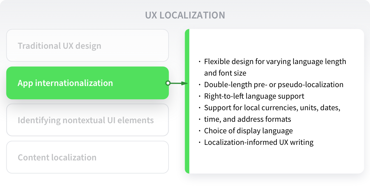
Considering language length and font sizes
Foreign language equivalents of texts in your own language will tend to be either shorter or longer. In some cases, the difference can be dramatic. For example, the word “user” in English is usually translated to “Benutzer” in German (twice as many characters) and “utilisateur” in French (almost three times as many characters).
Clearly, trying to squeeze all these extra letters into a space tailor-made for the shortest version will cause problems with display and layout, usability, and therefore UX.
Minimum font sizes that work (just) with languages like English may make other more complex language characters unreadable: 漢字, for instance. Additionally, line height used for English or similar Western languages may be too small for Chinese and other languages needing greater line heights. Whatever the font size or line height, the characters for any localized language must be readable. This may mean increasing minimum values for all language versions or possibly using different layout criteria for different locales.
Using double-length pre- or pseudo-localization to find problems
Word length problems caused by volume expansion as in the English/German/French example above can be detected by making a double-length version of separated text strings and displaying this double-length version. Text overruns will be much more obvious.
However, for app localizations that lead to volume contraction (English to Chinese, for example), the services of a native speaker with an eye for layout may be indispensable to identify where too much blank space is being generated and where fields, buttons, or layouts may need to be modified.
If your app runs on a PC or via a PC browser, using a keyboard, watch out for hotkey or macro-style key combinations that may not be available on keyboards for other languages. You may find it better to use function keys (F1, F2, F3, etc.) which are often available no matter which keyboard is being used. Alternatively, avoid this kind of hotkey functionality from the design stage onwards.
Handling app localization UX issues caused by layouts
A localized version of an app can lead to unsightly changes in layout, even when automatic adjustment is used (like Auto Layout in iOS.) The examples in the previous section indicate why this can happen. A layout that is lined up nicely in the default language may become distorted as it struggles to display foreign language equivalents.
Efforts to standardize on one set of dimensions for a language with medium space requirements may not work either, especially when volume expansion and contraction can double or halve text lengths, respectively. The best solution or compromise may be different in each case. It’s likely you will only recover a reasonable UI and UX that works for different localizations by trying different options and getting a native speaker’s input.
However, some options might include:
- Using dropdown menus to disguise length differences (this may lead to more clicks/taps being required, thus degrading usability).
- Dynamic layouts that display longer texts on two lines instead of one (visually, this may look inconsistent between different locales).
- Programmatic changes to layouts, driven by the language or locale (country/language combination) of the localization. This is a possible solution to the changing number of name fields between different localizations—see the usability section above.
Supporting right-to-left and left-to-right languages
Right to left (RTL) languages such as Arabic and Hebrew not only change the direction of text compared to English, for instance, but they also change notions of time and sequences of actions. RTL native language speakers may therefore expect to see a “trash can” on the left of the screen, rather than the right because that’s where they naturally end up before taking final action to throw something away.
Similarly, “next” and “back” buttons will logically be on the left and the right, respectively, instead of on the right and the left, as in English language screens. In RTL displays, time runs from right to left. Watch out also for icons used to indicate functions such as text justification. They too will need to read from right to left, for example, with a “ragged left” icon, instead of a “ragged right” one.
App interfaces that are highly dependent on lateral movement to make their logic and user experience work properly for LTR languages may need to be rethought and redesigned for RTL languages if the same quality of UX is to be achieved.
This is yet another aspect that’s best handled in the initial design phase, rather than trying to change an existing app. Sometimes you will not have the choice. However, if you are in the fortunate position of starting to design a new app, you can take these aspects into account, according to the different localizations you think you will require. You can also avoid the issue by using a vertical navigation design from the start, which obviates the need to start either from the left or the right.
UX writing with localization in mind
When UX writing is done with global audiences in mind, achieving a consistent international user experience gets easier.
To make your international UX writing work localization-friendly, do the following:
- Remove colloquial language from your English text
- Ditch idioms and phrases that don’t translate well or at all across languages
- Write unambiguous text to prevent users’ (and translators’) confusion
- Standardize the terminology used throughout the app
- Avoid homonyms
- Rely on term bases and glossaries
- Write short and concise user interface copy
- A/B test your UX writing to validate the international results
The importance of considering future localization during UX writing derives from a tenet that holds true for all globalized products: Internationalization is an investment in localization. If internationalization is done well, localization will be more straightforward and less costly because you won’t need to rework any aspects of your app to make it fit for a different market.
Other app internationalization considerations
On top of all these localizable items, there are also other internationalization best practices to ensure a truly cross-cultural user experience:
- Ensuring support for local currencies, units, dates, time, and address formats
- Choosing the appropriate decimal and thousand separators
- Using Unicode UTF-8 encoding to support international text and symbols
- Setting the right time zone for each market
- Formatting calendars correctly (in some cultures, the week starts on Monday, in others it starts on Sunday)
- Ensuring that international phone numbers are formatted correctly
- Considering the prevalent hardware and operating system in the target market and adjusting the UI accordingly
When all these internationalization and localization best practices come together, you will provide a user experience that is both truly international and tailored to the specific needs of your user base.

#3 Identifying non-textual UI elements for localization
Providing exceptional user experience when launching an app in a new market will inevitably require that culturally relevant elements are localized. Before that happens, however, first you need to identify them.
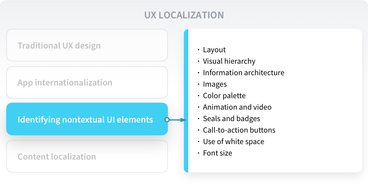
Here’s an overview of the most common non-textual elements you’ll benefit from localizing:
- Images depicting people, animals, symbols, places, and objects that are culturally relevant in the target market
- The color palette used in the UI, to avoid the negative connotations of certain colors in some markets
- The layout, visual hierarchy, and information architecture
- Animation and video used in onboarding screens and tutorials
- Awards and badges displayed on the app’s store information page, to make them locally relevant
- The use of white space
- Call-to-action buttons
- Font size
- The internal and external links on the app’s website, to avoid sending international users down the wrong path, etc.
Even strategic considerations such as the payment methods available at checkout and the frequency at which international users will be prompted to make in-app purchases will need localization considerations. This is why devising a well-thought-out localization strategy early on in the app’s development process is critical to a successful international user experience.
For a practical example of a company that got the non-textual localization aspect right, think of Airbnb. Their home screen includes an “Explore nearby” section that enables international users to instantly find the most relevant places to stay in their current location. This includes illustrations of local attractions, such as famous landmarks—nearby attractions will inevitably vary by country and city, and this is an aspect to keep in mind for future localization.

#4 Content localization
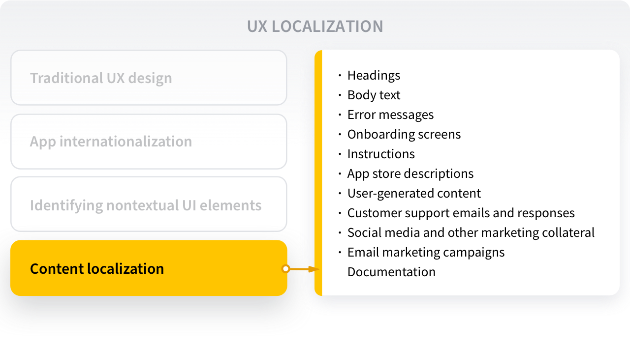
Now is the time to adapt the non-textual elements identified in the previous step and also localize the text components of your app: headings, body copy, error messages, onboarding screens, tutorials, and more.
This stage also includes all content outside your app, such as:
- App store descriptions
- User-generated content (e.g., reviews)
- Customer support emails and responses
- Social media and other marketing collateral
- Email marketing campaigns
- API documentation
- You can go about content localization in several ways. Some brands classify their content according to the level of visibility, impact, durability, and sensitivity, and then follow a human-only, automated, or hybrid approach to translation.
For example, creative copy is usually assigned to a qualified translator, whereas chatbot scripts and error messages are sometimes machine-translated and then edited by a human. The translation of highly perishable content like app store reviews is commonly raw automated machine-translation output.

How technology can influence the success of UX localization
Just like you have an array of systems and tools that help you with development, design, content, marketing, and customer support, UX localization can become significantly simpler as a result of the appropriate technology choices.
An app localization platform, for example, allows localization professionals to use a web-based interface to manage all tasks within the localization workflow, such as:
- Creating teams, projects, and tasks
- Pulling strings from the source code of your app into the localization platform
- Assigning team members for translation and review of said strings
- Importing the translated strings back into your source code
- Putting it all together and compiling localized builds of your app or website
- Centralizing the efforts of developers, designers, marketing managers, and executives by letting them work collaboratively in the same workspace
- Generating automatic UI screenshots that serve as context for translators and reviewers
- Checking for linguistic consistency across projects
- Automating tasks and workflows to save time
If you want to design your app’s UX for global success, consider increasing automation, centralization, and collaboration with an app localization platform from the start. This will enable your team to identify, prevent, and resolve UX internationalization and localization issues as early as possible in your app development process.


